
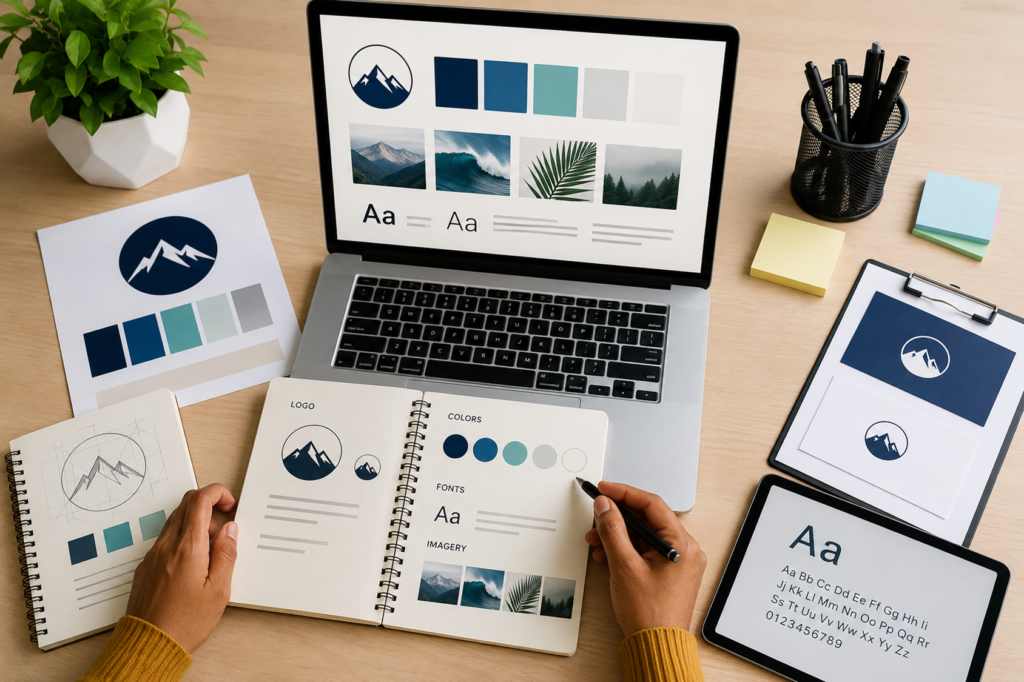
Consistency is the secret sauce of memorable brands. Whether you are a solo entrepreneur, a freelancer, or running a growing startup, every piece of content you put out—from social media posts and email newsletters to pitch decks and invoices—should look like it came from the exact same place.
When your visuals are scattered and inconsistent, your brand feels chaotic. But when your brand elements are organized and unified, you instantly build trust, look more professional, and become instantly recognizable to your audience.
The easiest way to achieve this consistency is by building a Brand Kit.
In this comprehensive guide, we will walk you through everything you need to know to set up a simple, highly effective Brand Kit that organizes your colors, fonts, logos, and overall visual style.
What is a Brand Kit?
At its core, a Brand Kit is a centralized digital home for all your core visual branding assets. Think of it as a style guide paired with a resource folder. It contains the exact ingredients you need to create any design, ensuring that anyone on your team—or even just you on a rushed Monday morning—can whip up branded materials without second-guessing a hex code or font choice.
Having a Brand Kit saves you hours of decision fatigue and guarantees that your visual identity remains bulletproof across every platform.
Step 1: Gather and Organize Your Logos
Your logo is the anchor of your visual identity. Before you can organize anything else, you need your logo files neatly categorized and formatted for different use cases.
What You Need:
- Primary Logo: Your main logo mark and wordmark used for most standard applications (website headers, primary social media profile pictures, major packaging).
- Secondary/Alternative Logo: A variation of your primary logo, such as a stacked version if your main logo is horizontal, or a simplified version for tight spaces.
- Submark/Favicon: A tiny, highly simplified icon or monogram (often just your initials or a graphic element) used for browser tabs, mobile apps, or tiny profile avatars.
Best Practices for Logo Files:
- Formats: Always keep vector formats (
.SVGor.AI/.EPS) for scalability, alongside transparent background PNGs for everyday use. Avoid JPEGs for logos unless they require a solid white background, as JPEGs introduce an unwanted white box around the image. - Color Variations: Make sure you have a full-color version, an all-white (reverse) version for dark backgrounds, and an all-black (or dark monochromatic) version for light backgrounds.
Step 2: Define Your Color Palette
Colors evoke immediate emotional responses and play a massive role in brand recognition. A simple, functional brand color palette shouldn’t look like a rainbow; it should rely on a disciplined mix of primary, secondary, and neutral shades.
The ideal 4-to-5 color structure:
- Dominant/Primary Color (1-2 colors): The main color that represents your brand personality (e.g., a deep navy blue for trust and professionalism, or a vibrant coral for energy and creativity). This will be used most frequently.
- Accent Color (1 color): A contrasting, eye-catching color used sparingly for call-to-action buttons, links, or elements you want to pop.
- Neutral Dark (1 color): A dark gray, charcoal, or near-black used primarily for body text and high-contrast elements. (Avoid pure
#000000black, as softer darks look more modern and easier on the eyes). - Neutral Light (1 color): An off-white, cream, or very pale gray used for backgrounds, card fills, or subtle layout divisions.
Pro-Tip: Record Your Hex Codes
Never rely on “eyeballing” a color. For every color in your palette, record its Hex Code (e.g., #FF5733), and if you plan on printing physical materials, note down the CMYK or RGB values as well.
Step 3: Establish Your Typography Hierarchy
Fonts carry voice and tone just as much as words do. Using too many typefaces makes a design look messy and amateurish. A simple brand kit should feature just two to three fonts max.
The Font Trio:
- Header Font: This is your personality font. It’s used for big titles, headlines, and attention-grabbing text. It can be a bold sans-serif, a classic serif, or a stylish display font depending on your brand’s vibe.
- Body Font: Readability is everything here. Choose a clean, highly legible typeface (like Inter, Open Sans, Roboto, or Lato) used for paragraphs, descriptions, and long-form reading.
- Accent/Subheading Font (Optional): A complementary font used for subheadings, quotes, or callouts. This is often an italicized version of your body font or a contrasting style.
Always define how these fonts will be used across sizes and weights (e.g., H1 should be Bold at 36px, Body text should be Regular at 16px) so every graphic maintains a cohesive typographic hierarchy.
Step 4: Define Your Visual Style & Imagery Rules
Colors and fonts are only half the battle. Your visual style dictates how you bring those elements together. This section of your brand kit acts as the “rulebook” for imagery, graphics, and layout aesthetics.
- Photography Style: What kind of photos represent your brand? Are they bright, airy, and candid? Or moody, high-contrast, and cinematic? Define whether you use people-centric lifestyle photos, abstract studio shots, or clean product photography.
- Graphic Elements & Shapes: Do you prefer sharp, geometric angles, or soft, organic curves and rounded rectangles? Do you use illustrations, icons, or flat vectors? Keep your motif consistent.
- Spacing and Layout (White Space): Does your brand look clean and minimalist with plenty of breathing room, or is it vibrant, dense, and energetic? Establishing rules around layout density keeps your designs looking intentional.
Step 5: Assemble and Store Your Brand Kit
Once you have gathered your logos, hex codes, font files, and style rules, it’s time to put them where they can actually be used.
- Platform-Based Kits: If you use design tools like Canva, you can build a digital Brand Kit directly inside the platform. Upload your logos, pin your exact hex codes, and set your default header and body fonts so they are always one click away.
- Cloud Folder: For assets like raw logo files and brand photography, create a dedicated cloud folder (Google Drive or Dropbox) with a clear folder structure:
01_Logos(SVG, PNG, Vector)02_Typography(Font installation files)03_Brand Guidelines PDF(A 1-to-2 page PDF summarizing your rules)04_Templates & Imagery
Final Thoughts
Building a simple Brand Kit isn’t a rigid corporate chore—it’s a massive time-saver that empowers you to create faster and look better. By organizing your colors, fonts, logos, and visual style into one accessible place, you ensure that every single design you ship feels cohesive, professional, and unmistakably yours.