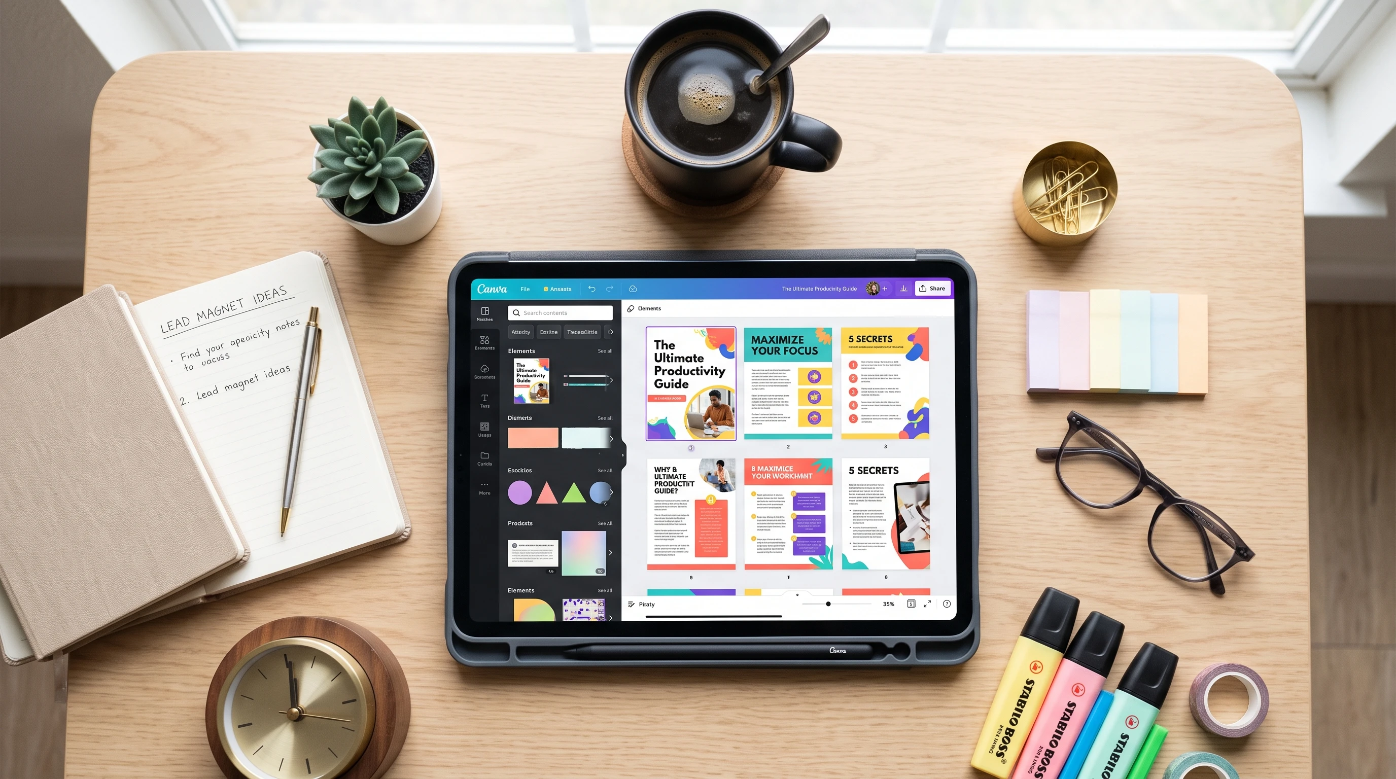
How to Create a Lead Magnet in Canva: Turn Your Knowledge Into a Polished Checklist, Workbook, Guide, or Mini Ebook

You have valuable knowledge, unique insights, and strategies that people are actively looking for. But turning those casual website visitors into loyal email subscribers—and eventually paying customers—requires a bridge. That bridge is a lead magnet.

A lead magnet is a high-value, free piece of content offered in exchange for an email address. Whether it is a quick-win checklist, an actionable workbook, an in-depth guide, or a comprehensive mini ebook, your lead magnet needs to solve a specific problem quickly and effectively.

However, great content alone isn’t enough. In today’s digital landscape, design matters. If your lead magnet looks cluttered, outdated, or poorly formatted, users will immediately question the quality of your expertise.

The good news? You don’t need a professional graphic designer or expensive software to create a jaw-dropping lead magnet. With Canva, you can design a polished, high-converting digital asset in a fraction of the time.

In this comprehensive guide, we will walk you through the entire process: from choosing the right format and planning your content, to designing a masterpiece in Canva and getting it ready for download.

Step 1: Choose the Right Lead Magnet Format

Before you open Canva or start writing text, you need to decide what you are creating. The best lead magnet is one that matches the type of transformation your audience needs.

Consider these four popular, high-converting formats:

1. The Checklist

  • Best for: Action-oriented topics where steps need to be checked off (e.g., “The Pre-Launch SEO Checklist” or “The Ultimate Packing List for Solo Travel”).
  • Why it works: It provides immediate gratification. Users love checklists because they break overwhelming tasks down into bite-sized, digestible actions.
  • Length: Usually 1 to 2 pages.

2. The Workbook

  • Best for: Interactive topics that require reflection, goal-setting, or exercises (e.g., “The Brand Strategy Workbook” or “Weekly Budgeting Exercise”).
  • Why it works: It engages the user actively rather than passively. When users write things down and complete exercises, they get a deeper sense of value from your brand.
  • Length: 5 to 15 pages.

3. The Guide / Cheatsheet

  • Best for: Step-by-step frameworks, formulas, or curated resource lists (e.g., “The 10 Best Tools for Remote Freelancers”).
  • Why it works: It positions you as an authority by gathering scattered information into one neat, easy-to-read reference document.
  • Length: 3 to 10 pages.

4. The Mini Ebook

  • Best for: Deep dives into a specific concept, methodology, or foundational strategy (e.g., “Intro to Modern Plant-Based Nutrition”).
  • Why it works: It allows you to showcase extensive subject-matter expertise while giving readers a substantial resource they can save and reference repeatedly.
  • Length: 10 to 30+ pages.

Step 2: Structure and Write Your Content

Once you’ve chosen your format, it’s time to write the content. A common mistake is trying to cram too much information into a lead magnet. Remember: speed to value is everything. Your lead magnet should solve one specific problem for your reader, not teach them everything you know.

Follow this outline structure for a successful lead magnet:

  1. The Hook / Cover Page (Page 1): A compelling title that highlights a clear benefit, your name or brand, and a clean cover visual.
  2. The Welcome / Intro (Page 2): Briefly introduce who you are, why you created this resource, and how the reader should use it to get the best results.
  3. The Core Content (Pages 3–N): Keep your paragraphs short, use plenty of bullet points, and leverage bold text for emphasis. If you are writing a workbook, leave plenty of blank space or clear text boxes for user notes.
  4. The Conclusion & Next Step (Final Page): Never leave your reader hanging at the end. Once they consume your lead magnet, what is the logical next step? Direct them to your website, invite them to book a call, or recommend your flagship product or course.

Step 3: Setting Up Your Design in Canva

With your written content ready, log into Canva.

  1. In the search bar, type your desired format followed by “document” or “ebook” (e.g., “Workbook Template”, “Checklist Template”, or “Ebook Template”).
  2. Browse through Canva’s massive library of pre-made templates.
  3. Pro-Tip on Branding: If you have set up a Canva Brand Kit (with your brand colors, primary fonts, and logo), choose a template that closely aligns with your visual identity so you don’t have to overhaul every element later.
  4. Click on your chosen template and select “Customize this template” to open the editor.

Step 4: Designing for Impact (Best Practices)

To make your lead magnet look like it was built by a high-end design agency, keep these core design principles in mind while editing in Canva:

Establish a Clear Visual Hierarchy

Your reader’s eyes should move naturally through the page.

  • Use a large, bold font for slide or page titles (H1).
  • Use a slightly smaller subheading style for sections (H2).
  • Keep your body text clean, consistent (around 11pt to 14pt depending on the font), and legible with comfortable line spacing.

Master White Space

Resist the urge to fill every square inch of the page with text or graphics. Margins and white space give your design “room to breathe,” making it look sophisticated and easy to read. Keep your text blocks well-padded away from the edges of the page.

Use Icons and Visual Breakouts

Break up walls of text by utilizing Canva’s element library:

  • Use checkmark icons next to list items.
  • Put key quotes or pro-tips inside colored background boxes (callout boxes).
  • Include numbered badges for step-by-step guides.

Maintain Color and Font Consistency

Stick to the 2-to-3 font rule and your core brand color palette established in your brand kit. Do not use random colors on every page; repetition breeds visual cohesion.

Step 5: Building Out Multi-Page Documents

If your lead magnet is a multi-page workbook or ebook, building it efficiently in Canva is all about duplication and consistency.

  1. Design a Master Page Layout: Before duplicating, make sure your header, footer (including page numbers and your website URL), and margins look perfect on a standard content page.
  2. Duplicate Pages: Use Canva’s grid view or page duplication buttons to create the necessary number of pages.
  3. Vary Layouts: While consistency is key, you don’t want every single page to look identical. Alternate between full-text layouts, text-and-image layouts, and exercise/worksheet layouts to keep the reading experience dynamic and engaging.

Step 6: Exporting Your Lead Magnet Correctly

Once your design looks pristine and you have proofread every sentence, it’s time to export your lead magnet so it is ready for public download.

  1. Click the Share button in the top right corner of Canva.
  2. Select Download.
  3. Under File Type, choose PDF Standard (best for digital documents and fast web loading) or PDF Print (if you want ultra-high resolution, though standard is usually ideal for downloadable guides).
  4. Ensure all pages are selected, and click Download.

Step 7: Delivering Your Lead Magnet to Subscribers

Now that you have a polished PDF file sitting on your computer, you need a mechanism to deliver it automatically when someone joins your email list.

  1. Upload the PDF: Upload your newly created PDF to your website media library, Google Drive, or your email marketing provider (like ConvertKit, Mailchimp, or MailerLite). Generate a direct share link.
  2. Create an Opt-in Form: Set up a simple landing page or embedded website form asking for a name and email address.
  3. Automate Delivery: Set up an automated welcome email in your email service provider. Paste the direct download link into the email so that the moment someone subscribes, your gorgeous Canva-designed lead magnet is delivered straight to their inbox.

Final Thoughts

Creating a high-converting lead magnet doesn’t have to be an exhausting, technical nightmare. By combining clear, concise copywriting with Canva’s powerful drag-and-drop design ecosystem, you can transform your hard-earned knowledge into a professional asset that builds instant trust, grows your email list, and elevates your brand.
How to Build a Simple Brand Kit: Organize Your Colors, Fonts, Logos, and Visual Style


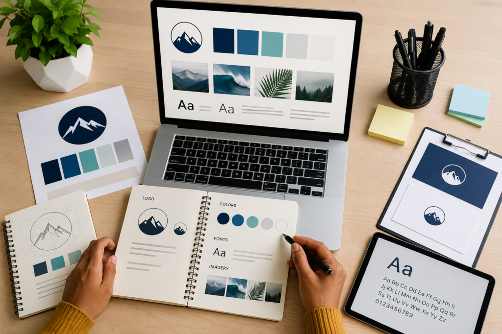
Consistency is the secret sauce of memorable brands. Whether you are a solo entrepreneur, a freelancer, or running a growing startup, every piece of content you put out—from social media posts and email newsletters to pitch decks and invoices—should look like it came from the exact same place.

When your visuals are scattered and inconsistent, your brand feels chaotic. But when your brand elements are organized and unified, you instantly build trust, look more professional, and become instantly recognizable to your audience.

The easiest way to achieve this consistency is by building a Brand Kit.

In this comprehensive guide, we will walk you through everything you need to know to set up a simple, highly effective Brand Kit that organizes your colors, fonts, logos, and overall visual style.

What is a Brand Kit?

At its core, a Brand Kit is a centralized digital home for all your core visual branding assets. Think of it as a style guide paired with a resource folder. It contains the exact ingredients you need to create any design, ensuring that anyone on your team—or even just you on a rushed Monday morning—can whip up branded materials without second-guessing a hex code or font choice.

Having a Brand Kit saves you hours of decision fatigue and guarantees that your visual identity remains bulletproof across every platform.

Step 1: Gather and Organize Your Logos

Your logo is the anchor of your visual identity. Before you can organize anything else, you need your logo files neatly categorized and formatted for different use cases.

What You Need:

  • Primary Logo: Your main logo mark and wordmark used for most standard applications (website headers, primary social media profile pictures, major packaging).
  • Secondary/Alternative Logo: A variation of your primary logo, such as a stacked version if your main logo is horizontal, or a simplified version for tight spaces.
  • Submark/Favicon: A tiny, highly simplified icon or monogram (often just your initials or a graphic element) used for browser tabs, mobile apps, or tiny profile avatars.

Best Practices for Logo Files:

  • Formats: Always keep vector formats (.SVG or .AI/.EPS) for scalability, alongside transparent background PNGs for everyday use. Avoid JPEGs for logos unless they require a solid white background, as JPEGs introduce an unwanted white box around the image.
  • Color Variations: Make sure you have a full-color version, an all-white (reverse) version for dark backgrounds, and an all-black (or dark monochromatic) version for light backgrounds.

Step 2: Define Your Color Palette

Colors evoke immediate emotional responses and play a massive role in brand recognition. A simple, functional brand color palette shouldn’t look like a rainbow; it should rely on a disciplined mix of primary, secondary, and neutral shades.

The ideal 4-to-5 color structure:

  1. Dominant/Primary Color (1-2 colors): The main color that represents your brand personality (e.g., a deep navy blue for trust and professionalism, or a vibrant coral for energy and creativity). This will be used most frequently.
  2. Accent Color (1 color): A contrasting, eye-catching color used sparingly for call-to-action buttons, links, or elements you want to pop.
  3. Neutral Dark (1 color): A dark gray, charcoal, or near-black used primarily for body text and high-contrast elements. (Avoid pure #000000 black, as softer darks look more modern and easier on the eyes).
  4. Neutral Light (1 color): An off-white, cream, or very pale gray used for backgrounds, card fills, or subtle layout divisions.

Pro-Tip: Record Your Hex Codes

Never rely on “eyeballing” a color. For every color in your palette, record its Hex Code (e.g., #FF5733), and if you plan on printing physical materials, note down the CMYK or RGB values as well.

Step 3: Establish Your Typography Hierarchy

Fonts carry voice and tone just as much as words do. Using too many typefaces makes a design look messy and amateurish. A simple brand kit should feature just two to three fonts max.

The Font Trio:

  1. Header Font: This is your personality font. It’s used for big titles, headlines, and attention-grabbing text. It can be a bold sans-serif, a classic serif, or a stylish display font depending on your brand’s vibe.
  2. Body Font: Readability is everything here. Choose a clean, highly legible typeface (like Inter, Open Sans, Roboto, or Lato) used for paragraphs, descriptions, and long-form reading.
  3. Accent/Subheading Font (Optional): A complementary font used for subheadings, quotes, or callouts. This is often an italicized version of your body font or a contrasting style.

Always define how these fonts will be used across sizes and weights (e.g., H1 should be Bold at 36px, Body text should be Regular at 16px) so every graphic maintains a cohesive typographic hierarchy.

Step 4: Define Your Visual Style & Imagery Rules

Colors and fonts are only half the battle. Your visual style dictates how you bring those elements together. This section of your brand kit acts as the “rulebook” for imagery, graphics, and layout aesthetics.

  • Photography Style: What kind of photos represent your brand? Are they bright, airy, and candid? Or moody, high-contrast, and cinematic? Define whether you use people-centric lifestyle photos, abstract studio shots, or clean product photography.
  • Graphic Elements & Shapes: Do you prefer sharp, geometric angles, or soft, organic curves and rounded rectangles? Do you use illustrations, icons, or flat vectors? Keep your motif consistent.
  • Spacing and Layout (White Space): Does your brand look clean and minimalist with plenty of breathing room, or is it vibrant, dense, and energetic? Establishing rules around layout density keeps your designs looking intentional.

Step 5: Assemble and Store Your Brand Kit

Once you have gathered your logos, hex codes, font files, and style rules, it’s time to put them where they can actually be used.

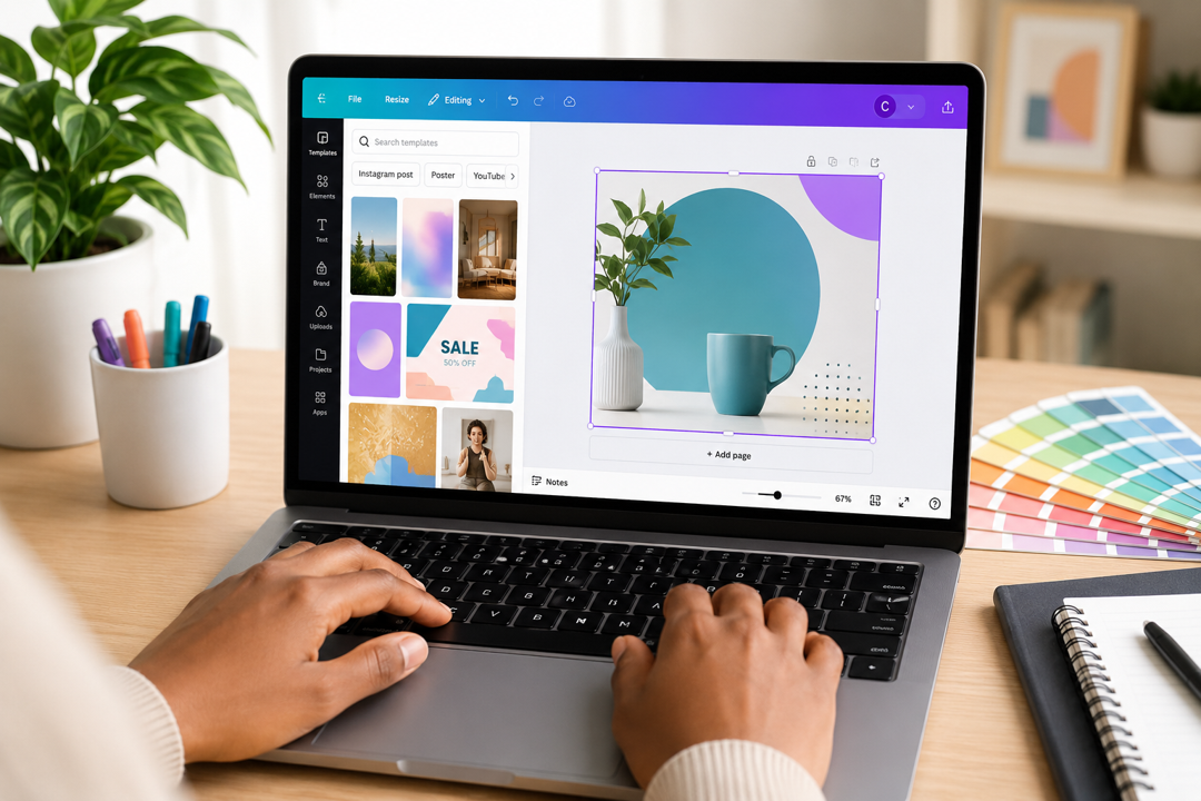
  • Platform-Based Kits: If you use design tools like Canva, you can build a digital Brand Kit directly inside the platform. Upload your logos, pin your exact hex codes, and set your default header and body fonts so they are always one click away.
  • Cloud Folder: For assets like raw logo files and brand photography, create a dedicated cloud folder (Google Drive or Dropbox) with a clear folder structure:
    • 01_Logos (SVG, PNG, Vector)
    • 02_Typography (Font installation files)
    • 03_Brand Guidelines PDF (A 1-to-2 page PDF summarizing your rules)
    • 04_Templates & Imagery

Final Thoughts

Building a simple Brand Kit isn’t a rigid corporate chore—it’s a massive time-saver that empowers you to create faster and look better. By organizing your colors, fonts, logos, and visual style into one accessible place, you ensure that every single design you ship feels cohesive, professional, and unmistakably yours.

How to Create Your First Canva Design: A Comprehensive Beginner’s Walkthrough

Embarking on your creative journey can feel both exciting and slightly intimidating. Whether you are an entrepreneur looking to whip up quick social media graphics, a student drafting a presentation, or a creative hobbyist wanting to bring your ideas to life, the thought of opening a blank design canvas can trigger a mild wave of panic. What colors go together? What font looks professional? How do I keep things from looking cluttered?

Fortunately, the digital design landscape has shifted dramatically over the years. You no longer need to spend months mastering complex, professional-grade software or wrestling with layered vector paths just to put together a clean poster or a polished Instagram post. Platforms like Canva have democratized visual communication, transforming a once-exclusive skill into an intuitive, accessible experience for everyone.

This comprehensive, step-by-step walkthrough is designed to take you by the hand and guide you through creating your very first Canva design from scratch. We will cover everything from picking the right template and navigating the interface to editing text, swapping out imagery, and finally exporting your masterpiece for the world to see.

Table of Contents

  1. Introduction to the Canva Ecosystem
  2. Phase 1: Getting Oriented and Choosing Your Template
  3. Phase 2: Anatomy of the Canva Editor
  4. Phase 3: Crafting and Editing Your Text
  5. Phase 4: Working with Images, Media, and Elements
  6. Phase 5: Layout Adjustments and Core Design Principles
  7. Phase 6: Exporting, Downloading, and Sharing Your Work
  8. Conclusion: Your Creative Future Starts Here

1. Introduction to the Canva Ecosystem

Before we dive straight into clicking buttons, it helps to understand what Canva is and why it has become an essential tool for millions of creators worldwide. At its core, Canva is a web-based and mobile-friendly graphic design platform that relies on a drag-and-drop mechanism.

In the past, creating a flyer meant choosing dimensions, setting up bleed lines, manually importing fonts, and arranging shapes pixel by pixel. Canva streamlines this entire pipeline by bundling pre-sized canvases, professionally designed templates, stock libraries, and powerful smart tools into one unified browser tab.

When you log into Canva, you aren’t just looking at a blank page; you are entering a massive collaborative workspace. Whether you use the Free tier—which is astonishingly robust and packed with hundreds of thousands of free templates and graphics—or you opt for a paid upgrade later on, the core principles of creating your first design remain identical.

2. Phase 1: Getting Oriented and Choosing Your Template

Every great design project starts with a single click on the home screen. When you open Canva, your primary goal is to determine what you are making and what dimensions it requires.

Step 1: Navigating the Home Dashboard

Take a moment to look at your dashboard. At the very top, you will see a prominent search bar. This is your command center. Instead of digging through menus, you can type your exact goal right into it—for instance, “minimalist wedding invitation,” “fitness YouTube thumbnail,” or “corporate quarterly report.”

Step 2: Selecting Your Canvas Size

If you prefer browsing by category, click the Create a design button in the top right corner. A drop-down menu will appear displaying popular options:

  • Instagram Post (Square or Portrait): Optimized for social feeds.
  • Presentation: Sized precisely for widescreen displays (16:9 ratio).
  • Doc: Great for text-heavy, collaborative layouts.
  • Flyer / Poster: Formatted for high-resolution printing.

Choosing the right preset saves you from the headache of manually resizing elements later. Once you click your format, a new browser tab will open, presenting you with your fresh workspace.

Step 3: Finding and Applying a Template

For your very first design, starting with a blank canvas can lead to staring blankly at a white rectangle. Instead, leverage Canva’s template library.

  1. Look at the left sidebar inside the editor; ensure you are on the Design tab.
  2. Use the search bar within that panel to narrow down styles (e.g., type “modern real estate” or “playful birthday”).
  3. Click on a template that catches your eye. It will instantly populate onto your canvas.

Think of a template not as a rigid final product, but as a scaffold. Every single color, text box, image, and graphic inside that template is fully customizable.

3. Phase 2: Anatomy of the Canva Editor

Now that your template is loaded on screen, let’s break down the interface so you know where everything lives. The editor is divided into three main zones:

  1. The Top Menu Bar: Here you will find options to rename your file, access version history, toggle the resize tool, and locate the vital Share button on the far right.
  2. The Left Sidebar (Your Toolbox): This is where you pull ingredients into your design.
    • Design: Templates and layout suggestions.
    • Elements: Shapes, graphics, stock photos, stickers, audio, video clips, charts, and grids.
    • Text: Headings, subheadings, body text blocks, and font pair combinations.
    • Brand Hub: Your saved logos, brand colors, and custom fonts (great for consistency).
    • Uploads: Your personal media hub where you can drag and drop images or videos from your computer.
    • Draw: Digital brushes and highlighters for freehand additions.
  3. The Canvas (Center Stage): Your active workspace. When you click any object on the canvas, a floating toolbar appears directly above it, offering quick adjustments tailored to that specific object (like color pickers, crop tools, or alignment buttons).

4. Phase 3: Crafting and Editing Your Text

Text is often the primary vehicle for your message. Whether you are writing a catchy headline or detailing event times, getting text right is crucial.

Editing Existing Text

  1. Click directly onto any text box in your template.
  2. Highlight the placeholder words and type your own copy.

Customizing Typography and Styling

Once a text box is selected, look at the floating toolbar at the top of the canvas:

  • Font Family: Click the dropdown menu to browse hundreds of typefaces. Beginner Tip: Avoid using more than two different font families in a single design. Stick to one bold header font and one clean, readable body font.
  • Font Size and Color: Use the plus/minus buttons or type a number directly into the size box. Click the colored letter icon (A) to change text color. If your template features an image, Canva will automatically suggest “Photo Colors” in the color palette picker, ensuring your text harmonizes with your background imagery.
  • Effects: Click the Effects button to add shadows, hollow outlines, neon glows, or curved text arches. Use these sparingly—subtlety often looks much more professional than heavy-handed styling.
  • Spacing: Click the spacing icon (three lines with arrows) to adjust letter spacing (tracking) and line spacing (leading). Opening up your letters just a tiny bit can instantly elevate a basic headline into something that looks custom-designed.

5. Phase 4: Working with Images, Media, and Elements

Visuals breathe life into your layouts. Learning how to swap and manipulate graphics is what turns a generic template into a personalized creation.

Swapping Backgrounds and Photos

Templates come with placeholder images, but you will want to use your own or source better ones from Canva’s library.

  1. Go to the Uploads tab to bring in your own photos, or click Elements and search for stock imagery.
  2. Drag your chosen image directly over an existing photo on the template. Notice how it snaps into place? That’s because templates often use Frames or Grids that automatically crop images to fit precise geometric shapes.

Utilizing Frames and Elements

If you want to place a photo inside a custom shape (like a circle, a torn paper edge, or a phone mockup):

  1. Go to Elements, scroll down to Frames, and select one.
  2. Drag any photo from your uploads or stock library and hover it over the frame. It will instantly snap inside, conforming to the shape. Double-clicking the frame allows you to pan and crop the image precisely how you want it.

6. Phase 5: Layout Adjustments and Core Design Principles

Even with great templates and text, knowing a few fundamental rules of design will ensure your first project looks clean, balanced, and intentional.

1. Master the Power of Whitespace

Beginners often make the mistake of filling every empty square inch of the canvas. Whitespace (or negative space) is the empty area around and between your design elements. Leaving breathing room around your text and graphics allows the viewer’s eye to rest and immediately grasp what matters most.

2. Establish a Clear Visual Hierarchy

When someone looks at your design, what should they read first? Second? Third?

  • The Hook (Headline): Make it the largest, boldest element on the page.
  • The Details (Subheadline/Body): Scale this down so it supports the main headline without competing with it.
  • The Call to Action (CTA): Position things like “Sign Up Today,” “Link in Bio,” or “RSVP Now” where they naturally catch the eye last.

3. Maintain High Contrast

Never sacrifice legibility for aesthetics. If you place dark gray text over a dark navy background, nobody will be able to read it. Always ensure strong contrast—dark text on light backgrounds, or light text on dark backgrounds.

7. Phase 6: Exporting, Downloading, and Sharing Your Work

You’ve tweaked your text, swapped your images, and fine-tuned your layout. Now it’s time to share your creation with the world.

Step 1: Review and Rename

Look at the top left corner of the editor where your project title is displayed. Click it and give your design a clear, descriptive name (e.g., Summer_Sale_Flyer_Final). This makes it much easier to find later in your Canva projects folder.

Step 2: Open the Share Menu

Click the purple Share button in the top right corner. A drop-down panel will appear with various collaboration and download options.

Step 3: Choose Your File Format

Click Download, where Canva will recommend a file type based on your design format:

  • PNG: The gold standard for digital graphics, social media posts, and images with transparent backgrounds. It offers crisp, high-quality rendering.
  • JPG: A smaller file size option, great for web sharing where loading speed matters.
  • PDF Standard / PDF Print: Essential for multi-page documents, resumes, ebooks, or files intended for physical printing. (Choose PDF Print with crop marks if you are sending a file off to a professional print shop).
  • MP4 Video or GIF: Perfect if your design includes animated text, moving graphics, or video backgrounds.

Step 4: Hit Download

Select your desired pages (if you are working on a multi-slide presentation), click Download, and watch your creation save directly to your device’s downloads folder.

8. Conclusion: Your Creative Future Starts Here

Creating your first design doesn’t have to be an overwhelming ordeal. By starting with a flexible template, systematically working through your text and imagery, and applying a few foundational rules like whitespace and visual hierarchy, you can produce stunning work on your very first try.

Design is a skill built through iteration and experimentation. Don’t be afraid to click around, test out wild color combinations, and explore Canva’s vast ecosystem of tools. Fire up your dashboard today, open up a blank canvas or a fresh template, and let your creativity take flight!

A Step-by-Step Canva Designer’s Guide for Beginners (2026 Edition)

Welcome to the ultimate beginner’s guide to Canva! Whether you are an entrepreneur looking to brand your business, a student putting together a standout presentation, or an aspiring creative wanting to build a foundation in digital design, Canva has revolutionized how the world creates visuals.

Gone are the days when you needed a degree in graphic design or expensive, complex software to build professional-grade assets. Today, Canva’s intuitive interface makes design accessible to everyone.

This comprehensive, step-by-step guide walks you through everything you need to know to go from absolute beginner to confident Canva designer in 2026.

Table of Contents

  1. Getting Started: Setting Up Your Account
  2. Navigating the Canva Dashboard
  3. Choosing Your Canvas & Dimensions
  4. Mastering the Editor Interface
  5. Working with Text, Elements, and Media
  6. Leveraging AI Tools & Smart Features
  7. Downloading, Exporting, and Sharing Your Work
  8. Essential Design Principles for Beginners

1. Getting Started: Setting Up Your Account

Before you can create, you need a workspace. Setting up Canva takes less than a minute:

  1. Head over to Canva’s website or download the mobile app on iOS or Android.
  2. Click Sign up in the top right corner.
  3. Register using your Google account, Apple ID, email, or social logins.
  4. Choose your account type (Personal, Small Business, Student, Teacher, etc.). This helps Canva customize your dashboard recommendations.

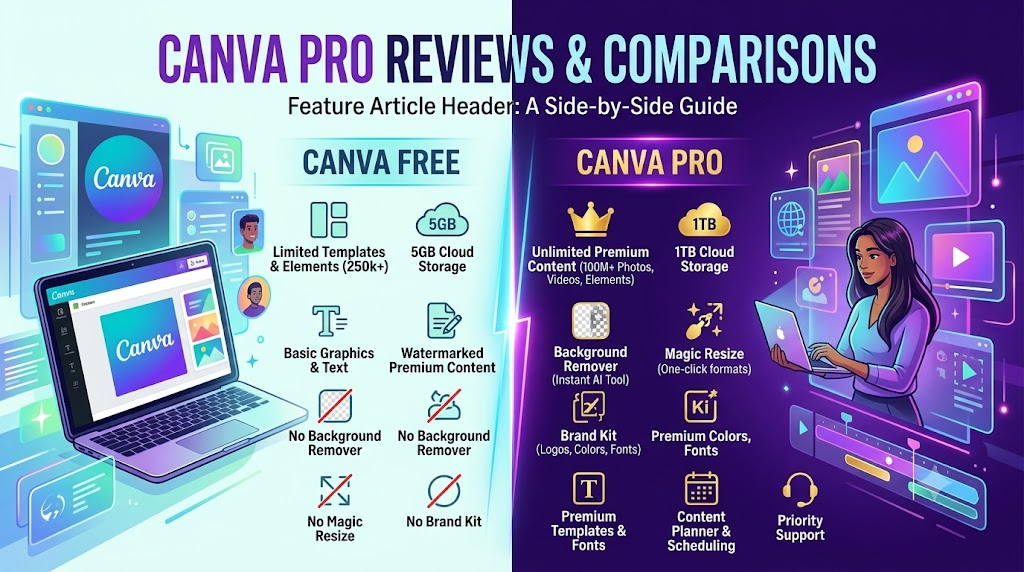
Free vs. Pro: Canva offers a robust Free plan that includes hundreds of thousands of free templates, stock photos, and graphics. However, if you want access to premium stock libraries, the Brand Hub, background remover, and advanced AI-generation tools, you can upgrade to Canva Pro or Canva for Teams.

2. Navigating the Canva Dashboard

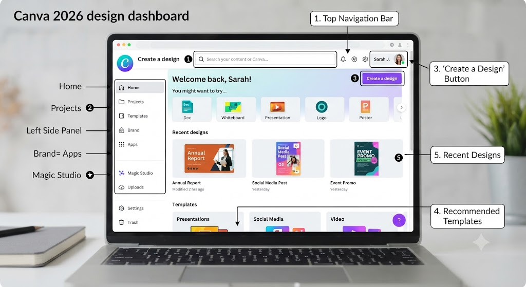
Once you log in, you’ll land on the home dashboard. Think of this as your central creative hub. Here is a quick breakdown of the main sections:

  • The Search Bar: Located right at the top. Type in anything you want to create (e.g., “YouTube thumbnail,” “real estate flyer,” or “minimalist resume”), and Canva will instantly generate hundreds of relevant templates and dimensions.
  • The Left Sidebar:
    • Home: Returns you to the main dashboard.
    • Projects: Where all your saved designs, folders, and uploaded files live.
    • Templates: A curated library to browse by category.
    • Brand Hub: Store your brand logos, color palettes, and fonts for consistency.
    • Apps: Explore third-party integrations (like AI image generators and QR code makers) that plug directly into Canva.

3. Choosing Your Canvas & Dimensions

One of the biggest hurdles for beginner designers is figuring out what size a design needs to be. Canva removes this guesswork entirely.

  • By Preset: Click Create a design in the top right corner. You’ll see a drop-down list of popular formats—Instagram Post, Presentation, Document, Video, and more. Selecting one opens a canvas pre-sized to exact industry standards.
  • Custom Dimensions: If you have specific print or web requirements, click Custom size at the bottom of the Create a design menu and enter your exact width and height in pixels, inches, millimeters, or centimeters.

4. Mastering the Editor Interface

When you click on a design or template, the Canva Editor opens. It is split into three main areas:

  1. The Top Menu Bar: Displays file settings, resize options, version history, and the Share/Download button.
  2. The Left Sidebar (Toolbox): Your toolkit for adding ingredients to your design:
    • Design: Browse templates for your current canvas.
    • Elements: Search for shapes, graphics, stickers, photos, audio, charts, and frames.
    • Text: Add headings, subheadings, body text, or trendy pre-paired text combinations.
    • Uploads: Upload your own images, videos, or audio files from your device.
    • Draw: Use digital pens and highlighters for freehand sketching.
  3. The Canvas (Center): Your workspace where your design comes to life. Click on any element on the canvas to edit, resize, reposition, or delete it.

5. Working with Text, Elements, and Media

Designing is all about arrangement. Here is how to handle the core building blocks:

Text

  • Click Text on the left sidebar and choose a text box style.
  • Use the floating toolbar above the canvas to change fonts, adjust font size, alter text color, change alignment, or add effects like shadows and neon glows.
  • Pro Tip: Stick to a maximum of two or three complementary fonts per design to keep it looking clean and readable.

Graphics & Elements

  • Go to Elements and search for icons, shapes, or illustrations.
  • Drag and drop elements onto your canvas. Use the corner handles to resize them, and the rotation handle to tilt them.
  • Frames and Grids: Look for “Frames” in the Elements tab. If you drag a photo into a frame, it will automatically crop itself into that shape (circles, laptops, polaroids, etc.).

Media Uploads

  • Easily drag and drop images or videos from your computer directly onto the Canva canvas.
  • Click an image and select Edit Photo to access tools like Background Remover, smart filters, and adjustments (brightness, contrast, saturation).

6. Leveraging AI Tools & Smart Features

Canva integrates powerful AI and automation features to speed up your workflow and enhance your layouts:

  • Magic Design / Text to Image: Type a prompt into Canva’s AI tools to instantly generate custom images or layout suggestions based on your input text.
  • Magic Write: Need copy for a presentation or social caption? Use Magic Write (Canva’s built-in AI copywriter) to draft text right inside your document or design.
  • Brand Templates: If you work with a team, you can lock certain elements of a design as a template so others can swap out text and images without breaking your visual guidelines.

7. Downloading, Exporting, and Sharing Your Work

Once your masterpiece is complete, it’s time to export and share it:

  1. Click the Share button in the top right corner.
  2. Download: Choose your preferred file format:
    • PNG or JPG: Best for social media posts, graphics, and images.
    • PDF Standard / PDF Print: Best for documents, multi-page reports, and flyers.
    • MP4 Video or GIF: Best for animated graphics, reels, and video presentations.
  3. Collaborate: You can also invite team members or clients to view, comment on, or edit the design in real-time by entering their email addresses.

8. Essential Design Principles for Beginners

To wrap up your journey into Canva design, keep these golden rules in mind:

  • Whitespace is your friend: Don’t cram every corner of your canvas. Leaving empty space lets your important text and visuals breathe.
  • Establish a visual hierarchy: Make your main headline the largest element so the viewer’s eye knows where to look first.
  • Maintain contrast: Ensure your text color stands out sharply against your background. Dark text on a light background (or vice versa) ensures maximum readability.
Recommended Reading
Continue exploring Canva and content creation with these Skilswave articles:
Ready to Unlock Canva’s AI-Powered Workflow?

Start experimenting with one Magic Studio feature at a time. As your confidence grows, combine these tools to create faster, maintain a consistent brand, and produce professional-quality content that supports your blogging, affiliate marketing, and online business goals. Explore more Canva tutorials and practical guides in the Skilswave Canva Resource Center.

You’re now ready to jump into Canva and start creating! Fire up your dashboard, experiment with a template, and let your creativity flow. Happy designing!

Best Canva Templates for Bloggers and Affiliate Marketers

In digital marketing, visual presentation isn’t just about making your content look nice—it is a core engine for audience retention, click-through rates (CTR), and affiliate conversions. Whether you are driving traffic from Pinterest, breaking up long-form text with engaging infographics, or publishing high-converting product comparison charts, high-quality graphics build immediate trust with your readers.

For creators balancing content writing, keyword research, link management, and site performance, building every design asset from scratch is simply not scalable. This is where Canva templates become an indispensable part of your publishing stack.

By utilizing structured, professionally designed templates, you can turn complex data into bite-sized visual hooks, streamline your social media distribution, and establish a cohesive, high-trust brand aesthetic across all channels.

Below is an in-depth guide to the best Canva templates and layout structures for bloggers and affiliate marketers, along with actionable design strategies to maximize your conversions.

Why Visual Design directly Impacts Affiliate Conversions

Affiliate marketing relies heavily on user trust and clear communication. When a visitor lands on your article, their initial impression is formed in fractions of a second.

  • Higher Skimmability: Most web readers do not read every word of a 2,000-word post. They scan headings, callout boxes, and images. Well-designed comparison graphics highlight the most critical product benefits immediately.
  • Increased CTR on Social Channels: Visual platforms like Pinterest and Instagram rely entirely on eye-catching vertical graphics to drive organic traffic back to your content.
  • Reduced Bounce Rates: Breaking up dense walls of text with custom diagrams, quote blocks, and infographics keeps readers engaged longer, sending positive user-experience signals to search engines.

1. High-Converting Product Comparison Tables & Feature Sheets

When readers are evaluating two or three competing products, they want quick, clear answers. Standard HTML tables can often feel rigid or plain, but visual comparison charts created in Canva deliver maximum clarity.

Essential Elements of an Affiliate Comparison Template:

  • Product Hero Shot: High-resolution product images or mockups on clean, non-distracting backgrounds.
  • Rating & Verdict Badges: Visual elements like star ratings, “Editor’s Choice” ribbons, or “Best Value” callouts.
  • Feature Checklists: Side-by-side green checkmarks and red “X” icons for key specifications (pricing, ease of use, customer support, money-back guarantees).
  • Call-to-Action (CTA) Mock Buttons: Prominent button-style graphic blocks (e.g., “Check Current Price”) that signal interactability.

Best Canva Search Terms to Find These Templates:

Product comparison table, Feature comparison chart, Product matrix infographic, Buying guide table

2. Pinterest Pin Templates Optimized for High CTR

Pinterest remains one of the largest organic traffic drivers for niche bloggers and affiliate marketers. Because Pinterest is a visual discovery engine, your pin design determines whether a user scrolls past or clicks through to your review post.

Ideal Dimensions & Best Practices:

  • Aspect Ratio: Standard 2:3 vertical aspect ratio (1000 x 1500 pixels) to maximize feed real estate.
  • Bold Headline Typography: High-contrast sans-serif or bold serif fonts that remain readable on small mobile screens.
  • Text Overlay Containers: Semi-transparent background cards or solid color blocks placed behind headline text to ensure legibility over photos.
  • Sub-Headlines with Intent Keywords: Short secondary text targeting problem-solving phrases (e.g., “Step-by-Step Guide,” “Honest Review,” “Before You Buy”).
  • Brand Watermarks: Subtle website URLs or logo marks near the bottom edge for brand recognition and attribution protection.

Top Pinterest Template Layouts:

  1. The “Listicle/Roundup” Layout: Features 3–4 stacked image cutouts showing different products featured in the guide.
  2. The “Problem-Solution” Layout: Uses a split-screen background with a prominent text card centered across the middle.
  3. The “Infographic Pin” Layout: A tall, step-by-step visual workflow ideal for “How-To” tutorials and software walk-throughs.

3. Lead Magnet & PDF Opt-in Templates

Building an email subscriber list is crucial for long-term affiliate revenue. Rather than relying on simple text opt-ins, offering high-value downloadable resources—such as checklists, buyer’s guides, or cheat sheets—dramatically increases subscriber conversion rates.

Recommended Lead Magnet Templates:

  • Ebook & Guide Cover Templates: Professional, publication-style covers featuring clean titles and minimalist author branding.
  • Checklists & Resource Worksheets: Cleanly structured, single-page or multi-page templates with editable checkboxes, bullet points, and highlight sections.
  • 3D Digital Product Mockups: Canva layout frames that display your digital lead magnet as a 3D book, tablet, or device screen. Placing these mockups on your landing pages or inline opt-in forms creates tangible value for potential subscribers.

4. Blog Post Featured Images & Header Banners

Your featured image sets the visual tone for the entire article. Standard stock photos can feel generic, but custom featured image templates elevate your content and make social media shares look clean and authoritative.

Key Features of Great Blog Header Templates:

  • Consistent Dimensions: Standard 1200 x 630 pixels (which aligns perfectly with Open Graph social preview standards for Twitter/X, Facebook, and LinkedIn).
  • Balanced Focal Points: Ample negative space to prevent headlines from overlapping main background visuals.
  • Brand Color Accents: Consistent application of your site’s core color palette.

5. Educational Infographics & Data Visualizations

Complex affiliate reviews—such as technical software breakdowns, financial tool reviews, or hosting comparisons—benefit immensely from visual summaries. Infographics synthesize dense information into clear graphics that are highly shareable and frequently linked to by other sites.

Effective Infographic Formats for Marketers:

  • Process & Timeline Infographics: Perfect for showing a multi-step onboarding process or workflow setup.
  • Pros & Cons Visuals: Two-column templates with green and red accent containers for quick evaluation.
  • Stat & Percentage Highlights: Large typography cards emphasizing key metrics, speed test results, or ROI figures.

How to Customize Canva Templates to Match Your Brand Aesthetic

Using templates doesn’t mean your site needs to look like everyone else’s. Customizing standard templates to match your brand identity ensures visual recognition across your entire content network.

Step 1: Establish Your Core Brand Kit

Set up your Canva Brand Kit with your exact site branding assets:

  • Color Palette: Choose 2 primary colors (e.g., deep slate blue and crisp white) and 1 high-contrast accent color for buttons or highlights (e.g., emerald green or warm coral).
  • Typography Hierarchy: Define a primary heading font (e.g., Montserrat or Playfair Display) and a readable body font (e.g., Inter, Lato, or Open Sans).
  • Logo Variations: Keep primary, monochrome, and icon-only versions of your logo ready for fast placement.

Step 2: Use “Style Shuffle” for Quick Customization

When you open a new template in Canva, navigate to the Brand Kit panel on the left sidebar and click your brand color palette. Canva will automatically recolor the entire template to match your brand hues. Click again to shuffle color positions until you reach the right balance.

Step 3: Replace Generic Stock with Product-Specific Assets

Swap out generic stock photos with real screenshots, interface close-ups, or unboxing images. Authentic visuals significantly increase trust compared to overly polished stock photography.

Summary Checklist for Marketers

Asset Type Primary Use Case Recommended Canva Search Terms
Comparison Tables Product reviews & vs. articles Product comparison table, Matrix chart
Pinterest Pins Driving viral traffic from Pinterest Pinterest pin mockup, Blog graphic 1000x1500
Lead Magnet Mockups Email subscriber generation Ebook cover mockup, Worksheet lead magnet
Blog Headers Site featured images & social previews Blog featured image, Article header banner
Infographics Backlink generation & deep reviews Process infographic, Pros and cons chart

Final Thoughts

Investing time into clean visual design yields compounding returns. By leveraging pre-built Canva templates and tailoring them to your brand, you streamline your visual content creation workflow, improve site metrics, and present your readers with clear, high-trust visual information.

Related Articles

Continue learning with these Skilswave resources:

Start Building Your Canva Template Library Today

Professional design doesn’t require years of graphic design experience—it requires the right systems. Start by choosing a few core Canva templates for your blog, social media, and lead magnets. Customize them with your brand colours, fonts, and messaging, then reuse them consistently to create a recognizable visual identity that supports your content and affiliate marketing goals.

Want to learn more? Explore the Skilswave Canva Resource Center for step-by-step tutorials, practical design tips, and marketing resources that help you create content with confidence

Canva AI Magic Studio: Complete Beginner’s Guide (2026)

Design used to require a steep learning curve, a dedicated budget, or hours spent tweaking pixels in complex editing software. In 2026, the creative landscape looks fundamentally different. Canva’s Magic Studio has established itself as an all-in-one, AI-powered creative engine that bridges the gap between raw idea and polished graphic.

Whether you are a small business owner launching a product, a social media strategist creating daily content, or an educator putting together lesson plans, Magic Studio provides a cohesive suite of generative tools built directly into the familiar Canva interface.

This comprehensive beginner’s guide breaks down everything you need to know about Canva AI Magic Studio in 2026: what tools are included, how to use them step-by-step, and how to get maximum impact with minimal friction.

What Is Canva Magic Studio?

Canva Magic Studio is a centralized ecosystem of artificial intelligence tools embedded within Canva. Rather than treating AI as a side feature or requiring separate web apps for text, imagery, and video, Magic Studio brings generative AI directly onto the canvas.

What sets Magic Studio apart in 2026 is contextual brand awareness. Instead of producing generic, disconnected AI outputs, the system reads your brand identity—including your designated fonts, color palettes, tone of voice, and visual rules—before generating a single pixel or word. As a result, initial drafts feel surprisingly tailored and ready for immediate refining.

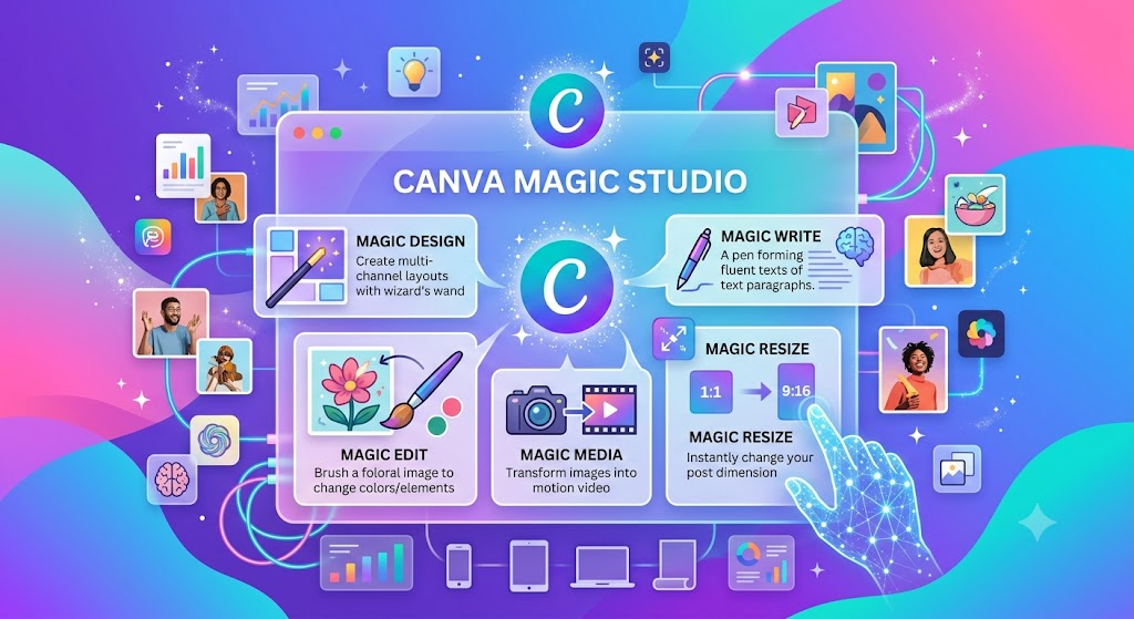
Core Tools in the Magic Studio Suite

Magic Studio isn’t just a single feature—it’s a collection of complementary tools designed to address every stage of the visual creation process. Here is a breakdown of the primary tools available inside the suite:

1. Magic Design

Magic Design eliminates the intimidating “blank page” syndrome. By typing a plain-language prompt or uploading an initial photo, Magic Design evaluates your intent and generates a selection of complete, tailored layouts.

  • Magic Design for Social: Produces multi-page story posts, carousel slides, or ad graphics with pre-set typography and balanced focal points.
  • Magic Design for Presentations: Generates full slide decks with logical outline flows, formatted data points, and contextually appropriate slide layouts.
  • Magic Design for Video: Assembles video clips, transitions, and text overlays into draft video content from uploaded media or prompts.

2. Dream Lab & Magic Media

For image and video generation, Canva integrates Dream Lab alongside its Magic Media tools.

  • Dream Lab: Powered by advanced commercial diffusion models, Dream Lab specializes in hyper-realistic product lifestyle shots, stylized illustrations, and custom visual backgrounds. It includes style-transfer capabilities, allowing you to upload a reference image so new visuals adopt the same artistic aesthetic.
  • Magic Media (Image & Video): Lets you turn text prompts into short motion clips (up to 4K resolution) or static graphics, ideal for dynamic social feeds and presentation accents.

3. Magic Switch 3.0

One of the biggest time-savers in the suite, Magic Switch allows you to transform design assets into entirely different formats without breaking your layout structure:

  • Format Conversion: Instantly turn a pitch presentation into an executive summary document or blog draft.
  • Intelligent Resizing: Scale a single square Instagram post into a vertical Story, a horizontal LinkedIn header, and a printable flyer while automatically adjusting asset positions.
  • Layout-Preserving Translation: Translate text across 150+ languages while preserving typography, line wrapping, and spatial balance.

4. Precision Photo Tools: Magic Grab, Magic Expand & Magic Edit

Editing photos previously required specialized layering skills. Magic Studio simplifies complex photo manipulations into point-and-click actions:

  • Magic Grab: Detects the main subject in a flat image and isolates it onto an editable layer, allowing you to reposition the object or change the background behind it.
  • Magic Expand: Generously extends image borders using AI in-painting to fit challenging aspect ratios without awkward cropping or stretching.
  • Magic Edit: Brush over an area of a photo (such as a couch or jacket) and type a prompt (like “change color to navy blue” or “add a coffee cup”) to swap elements naturally.

5. Magic Write

Integrated directly into text frames and Canva Docs, Magic Write serves as an AI copywriting assistant. It can draft compelling headlines, rewrite long-winded paragraphs into concise bullet points, adjust tone, or expand quick notes into full captions. When linked to your Brand Voice settings, it maintains consistent language across all written outputs.

6. Canva Sheets & Magic Charts

For business reporting, Canva Sheets acts as an embedded data sheet within your workspace. Selecting a data range and invoking Magic Charts automatically converts raw numbers into beautifully styled, brand-matched charts and graphs ready for presentations.

Step-by-Step Tutorial: Creating a Campaign from Scratch

To help you get comfortable with Magic Studio, here is a practical workflow that takes a campaign from initial concept to multi-channel deployment in minutes:

Step 1: Set Up Your Brand Kit First

Before generating designs, ensure your Brand Kit is configured in Canva. Upload your brand logo, set primary and secondary color palettes, and select your default typography styles. Magic Studio draws from these rules to ensure generated layouts conform to your brand identity automatically.

Step 2: Generate Core Layouts with Magic Design

  1. From the Canva home screen, click the search bar or the Magic Studio tab.
  2. Select your base format (e.g., Instagram Post or Presentation).
  3. Type a descriptive prompt in the Magic Design search box.
    • Weak Prompt: “Post for a coffee shop.”
    • Strong Prompt: “Minimalist promotional post for an organic cold brew coffee launch, featuring warm earth tones and modern typography.”
  4. Review the generated drafts, select the structure you prefer, and click Apply Brand Kit to align colors and fonts with your brand.

Step 3: Refine Visuals and Photo Elements

  1. Swap stock photos with custom imagery generated in Dream Lab or uploaded product shots.
  2. Use Magic Grab if you need to separate your main product from its original background and overlay text behind it.
  3. Apply Magic Expand if your photo doesn’t quite fill the top or sides of the template layout.

Step 4: Polish Content with Magic Write

  1. Click any headline or text block and press the slash key (/) or tap the Magic Write icon.
  2. Ask Magic Write to tighten the copy or generate a call-to-action.
  3. Select preset tone options such as Professional, Casual, or Persuasive to match your target audience.

Step 5: Repurpose Across Channels with Magic Switch

  1. Click Magic Switch from the top menu bar.
  2. Choose Resize and select alternative formats (e.g., LinkedIn Banner, Facebook Post, Story format).
  3. Review the newly formatted options, make quick visual adjustments, and export or schedule your posts directly through Canva’s Content Planner.

Best Practices for Better AI Results

To get clean, professional results out of Magic Studio, keep these practical principles in mind:

Practice Tip for Success
Be Specific with Context State the platform, audience, purpose, and visual style in your prompt. Specific details reduce generic outputs.
Use AI as a First Draft Treat Magic Design and Magic Write as starting points rather than final products. Always spend 2 minutes polishing the layout and reviewing copy.
Maintain Visual Breathing Room Generative tools can occasionally over-pack a layout. Delete extra decorative elements and maintain ample white space around headlines.
Choose the Right Tool for the Job Use Dream Lab for hero images and unique campaign visuals. For standard icons, simple shapes, or common objects, Canva’s standard stock library is faster and conserves credits.

Canva AI Plans and Pricing Overview

Canva Magic Studio features are accessible across different account tiers:

  • Canva Free: Offers basic access to Magic Design and standard Magic Write functionality, with limited monthly AI generation credits.
  • Canva Pro: Unlocks full access to the Magic Studio suite, complete Brand Kit integration, expanded credit limits for Dream Lab and video creation, background removal tools, and 1TB of cloud storage.
  • Canva Teams & Enterprise: Adds administrative controls, single sign-on (SSO), advanced asset governance, custom Brand Voice guidelines across multiple team members, and enhanced legal protections via “Canva Shield”.

Summary

Canva AI Magic Studio turns complex visual design into an accessible, conversational workflow. By combining rapid layout generation, precise photo editing, and brand-aware copywriting into a single environment, it allows creators and businesses to move from initial idea to finished campaign faster than ever.

By setting up your Brand Kit, mastering targeted prompts, and using AI as an accelerator for your creative vision, you can produce consistent, high-impact visuals for every channel.

Recommended Reading
Continue exploring Canva and content creation with these Skilswave articles:
Ready to Unlock Canva’s AI-Powered Workflow?

Start experimenting with one Magic Studio feature at a time. As your confidence grows, combine these tools to create faster, maintain a consistent brand, and produce professional-quality content that supports your blogging, affiliate marketing, and online business goals. Explore more Canva tutorials and practical guides in the Skilswave Canva Resource Center.

How To Design Professional Lead Magnets Using Canvas

lead magnet template on Canva
Canva has turned into a go-to tool for anyone who wants professional designs without needing to hire a designer or spend weeks learning complicated software. The great thing is, I’ve used Canva for years to make all sorts of lead magnets, and it does pretty much everything you’d want for free or at a super low cost.

Lead magnets are basically free resources you give away to get people onto your email list. They’re great for growing your audience, connecting with people who actually want what you offer, and boosting things like affiliate sales, course sign-ups, or even plain old brand awareness. If you want to grow your email list fast, creating a lead magnet in Canva can really help.

Here’s a step-by-step guide to designing lead magnets using Canva, with no tech headaches or design school required.


What Is a Lead Magnet and Why Does It Matter?

A lead magnet is a free digital download or resource you offer to someone in exchange for their email address. The main goal is to give them something useful so they’ll want more from you in the future. The truth is, people need a reason to hand over their email. If you’re just asking, most will pass, but if you offer something cool or helpful, it’s way easier!

Common lead magnets made in Canva include:

  • Short ebooks or guides
  • Checklists and cheat sheets
  • Templates or worksheets
  • Planners and calendars
  • Mini courses (delivered as PDFs or slides)
  • Workbooks and resource lists
  • Swipe files or sample packs

I’ve built all these (and more) inside Canva. You don’t need pro design chops, just a clear offer and a bit of creativity.


Getting Clear on Your Audience and Offer

Before firing up Canva, you need two things figured out: who you’re making this for, and the pain point or goal your lead magnet helps with. It sounds basic, but it’s amazing how many folks skip this and end up with freebies nobody downloads.

Ask yourself:

  • Who’s your ideal subscriber? (ex: bloggers, busy moms, online store owners, etc.)
  • What’s one problem they really want solved, or a quick win you can give?
  • Can you deliver that win in a short, visual, or interactive format (PDF, template)?

Getting specific keeps your content and design focused, plus makes your lead magnet stand out. Instead of “General Business Tips,” try “Weekly Social Media Checklist for New Coaches.”


Choosing the Right Lead Magnet Format

Think about what works best for your topic, audience, and how much info you need to provide. Here are some ideas, along with tips I use to match format to need:

  • One-Page Checklist. Super quick win (ex: “Email Newsletter Launch Checklist”).
  • Short Guide or Ebook. Good for breaking down a process or sharing steps.
  • Workbook or Planner. Interactive, perfect for personal growth, fitness, finance, or business planning.
  • Fillable Template or Swipe File. Very handson; templates for blog posts, resumes, or captions do great.
  • Resource List. Curate tools, links, or goto resources for your niche.

I usually pick my format based on what my readers ask for and how much detail they need at the first touch.


Starting Your Design in Canva

Here’s where the fun begins. Canva’s interface is easy, but I like to keep a few things in mind to stay organized and efficient:

  1. Sign up (if you haven’t yet) and open Canva. The free version works fine for lead magnets.
  2. Search for templates. Type terms like “ebook,” “planner,” or “checklist” and scroll through options. You can filter for “free” designs.
  3. Pick a template that matches your vibe and content length. Don’t stress, almost any layout is tweakable.
  4. Change the colors and fonts to match your website or brand. Even with templates, this keeps your stuff unique.

If you want a completely custom look, click “Create a Design,” set your custom dimensions (for PDFs, 8.5×11 inches is standard), and start from scratch.


Structuring and Writing Content for Your Lead Magnet

The best lead magnets solve a problem quickly and simply. Before adding anything to Canva, I usually sketch out the sections and rough text in a Google Doc or on paper. That way, I’m not distracted by decorations before my info makes sense.

General structure for a simple lead magnet:

  • Title/Cover: Clear, bold, easy to read (ex: “30Minute Meal Planner for Busy Parents”)
  • Short Introduction: Just a few lines on what this is and who it’s for
  • Main Content Pages: Break down into bitesized sections, prompts, or steps
  • CalltoAction Page: Where to find you, follow, or check out your next step (website, free group, product, etc.)

Keep language light and helpful, especially since people skim PDFs. Use bullet points and big headings wherever possible.


Design Tips for Polished, EyeCatching Lead Magnets

I’ve learned a few tricks that keep my Canva designs looking pro, even if I’m pulling everything together at the last minute:

  • Rely on whitespace and avoid overcluttering. Give each idea room to breathe.
  • Use no more than 23 fonts, one for headlines, one for body, maybe a script for accents.
  • Select a clear color palette and use it throughout. Canva has readytouse palettes, or grab your own brand colors.
  • Add icons, shapes, and lines for emphasis rather than big blocks of text. Canva’s free elements menu has a ton of handy graphics.
  • If you include images, stick with photos or illustrations that actually add to your topic (don’t force them in).
  • Make sure download settings are right for print or digital delivery, usually PDF Standard for email, or PDF Print if you want readers to print the pages.

Before finishing up, I hit “Present” or preview mode in Canva to see the design as a fullscreen reader would see it.


How to Make Your Lead Magnet Interactive

Lead magnets that readers interact with (like fillin boxes, planners, or clickable checklists) get way more engagement and shares. Canva Pro lets you make PDFs fillable, but you can also design spaces for handwriting or digital notes.

  • Leave boxes, lines, or shaded areas for readers to write in if they print it
  • If your lead magnet is a worksheet, include prompts and blanks
  • Add real links to resources or your website, highlight text, click the link icon, and paste your URL
  • Try Canva’s “Download as PDF with links” feature for clickable downloadables

I’ve seen super high optin rates from short forms, journals, and planners that people actually want to write in or save. Interactive lead magnets are a great way to stand out, especially when so many optins are just static PDFs.

To make your lead magnet even more engaging, think about embedding quick challenges, quote boxes, or feedback forms (like Google Forms) through QR codes or clickable links. This adds an extra layer customers enjoy, and you can learn more about your audience as a nice bonus.


Download, Delivery, and Growing Your List

Once your design is done:

  1. Hit the Download button in Canva (PDF Standard).
  2. Test the file to make sure links work and everything formats correctly.
  3. Upload the file to your email platform (like ConvertKit, MailerLite, or Mailchimp) and set it as your email automation’s freebie download.

Don’t forget to test the optin process yourself! If you don’t want to mess with email services, Google Drive or Dropbox work for delivering the file (but use email if you want to actually grow your list).

To get more eyes on your freebie, mention it in your blog posts, add a prominent signup box to your site, or create social posts with a direct call to action. You can also consider running a small paid ad to your optin page if you want to ramp things up. Be clear about the value, use an eye catching cover image, and always check that the user experience is smooth from signup to download.


Tips for Consistent Success With Canva Lead Magnets

  • Start with one lead magnet and improve it based on feedback, don’t try to create five different types all at once!
  • Let readers know how to use your freebie. One page explaining the value, or tips for getting started, helps a bunch.
  • Keep a swipe file of Canva templates that work for your brand so you can quickly refresh or create more downloads down the road.
  • If you know your lead magnet is popular, switch to Canva Pro for features like branding kits, resize options, and premium assets. It’s worth checking out for volume creators.
  • Keep your design fun and friendly, your personality is what people remember most!
  • Every few months, review your lead magnet stats to see if downloads, open rates, or signups are dropping. If so, tweak your design, language, or offer to keep things fresh and appealing.

Common Questions About Canva Lead Magnets

Do I need to pay for Canva Pro?

The free version handles almost everything you need for classic PDFs, printables, and templates. Pro helps if you want brand kits, premium assets, or special formats, but it’s not required to start.

What if I’m not a designer?

Canva is built for non designers! Just keep it simple. The builtin templates handle a lot of the heavy lifting. Stick to clear fonts, simple color schemes, and an uncluttered layout.

What should I avoid when designing?

  • Don’t overload with dense text blocks.
  • Avoid mixing lots of fonts, colors, and graphics.
  • Skip blurry or random stock pictures; less is more.

How can I make my lead magnet stand out?

  • Offer a specific quick win, not general advice.
  • Use your real personality and voice, speak how you’d chat with your readers.
  • Add small, useful tip boxes, checklists, or bonus sections.
  • Test different styles: try a onepager or a longer workbook, see which gets more signups.

Ready to Make Your Own Lead Magnet?

Creating pro looking lead magnets is much easier than most people think. I’ve seen Canva lead magnets turn cold visitors into loyal subscribers, and the process just gets easier every time.

Your Quick Start Plan:

  1. Pick a basic template and tailor it to your brand colors and fonts.
  2. Write out your content before you add it to Canva so you stay focused.
  3. Save your final design as a PDF, check all links, and make sure it’s easy to use.
  4. Share your lead magnet where your target readers hang out, on your website, social media, or in guest blog posts.

One solid, super helpful lead magnet is all it takes to start building trust and connection with your audience. Once you do it the first time in Canva, it feels pretty rewarding, and super useful for growing your list.

Wrapping up, building a strong email list starts with a lead magnet that genuinely helps people and looks appealing. Using Canva to craft your resource lets you skip the tech stress and focus on what matters most: giving your future fans something they’ll love and remember. So jump in, pick a template, and start growing your audience today!

Recommended Reading

Continue building your design and marketing skills with these related Skilswave resources:

Build Your First Professional Lead Magnet Today

Ready to create a lead magnet that attracts subscribers and strengthens your affiliate marketing strategy? Explore the Canva tutorials and resources in the Skilswave Canva Resource Center, then start designing a guide that delivers real value to your audience. Remember: the most effective lead magnets are the ones that solve a specific problem clearly, professionally, and with confidence.


give me a comprehensive detailed con

How To Create High-Converting Pinterest Pins With Canva (2026 Beginner’s Guide)

A set of eye-catching Pinterest Pins designed in CanvaPinterest stands out as a powerful search engine where people find ideas, inspiration, and solutions. I’ve found that one strong Pin has the potential to keep sending traffic long after it’s been posted, which really separates Pinterest from platforms where posts disappear quickly. If you’re trying to grow your blog, share your business, or promote your products, learning how to make Pins that grab attention and get clicks is a solid skill that pays off.
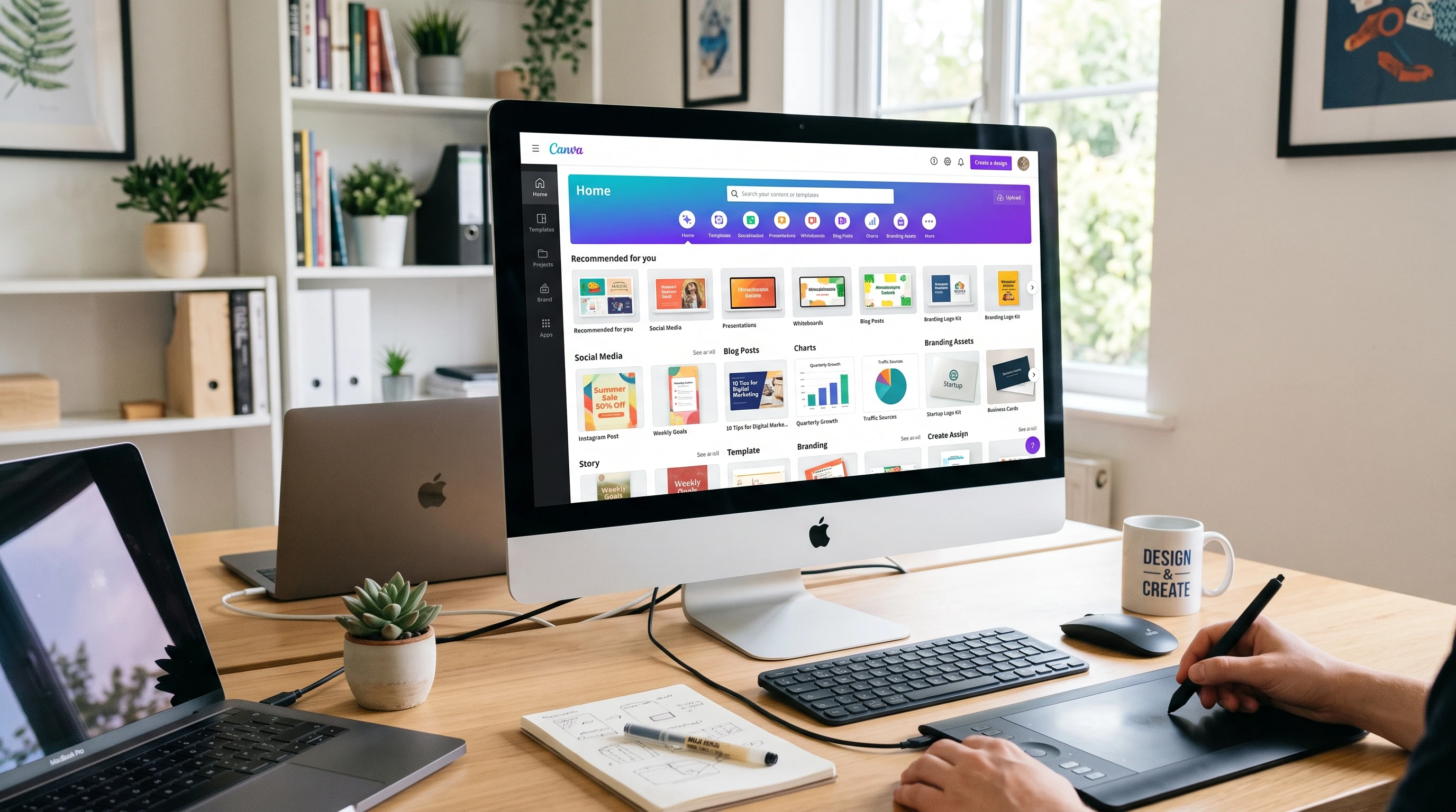
You might be thinking you need to be a designer to succeed here, but that’s not true. Canva makes it straightforward and fun to design Pins, even if you’re just starting out. In this guide, I’m sharing everything I’ve learned about designing Pinterest graphics that look great, show up in search, and make people want to click. Whether you’re brand new or looking to improve your results, you’ll find steps you can use right away.


Step 1: Understand the Basics of High-Converting Pinterest Pins

If you want your Pins to connect with your audience, it’s smart to know what works on Pinterest. I’ve found that Pins that convert well tend to have clear messaging, strong visuals, and a focus on the viewer’s needs. Understanding the ways Pinterest users interact with content can go a long way in helping your Pin stand out from the crowd. When you see what’s popular and why it works, you can borrow the underlying ideas and rework them for your unique brand or content. This awareness will give you an edge as you brainstorm new designs and fine-tune your approach over time.

What Makes a Pin High-Converting?

  • Vertical format for better display in feeds (1000 x 1500 pixels is ideal).
  • Bright, high contrast colors that catch the eye and set the right mood for your topic.
  • Easy to read fonts with bold text for the headline so your message is clear, even on small screens.
  • Prominent branding, like a logo or website name, making it easier for viewers to remember you and find you again.
  • A simple call-to-action, such as “Read More” or “Shop Now,” guides users toward your content.

Reviewing popular Pins in your niche helps you spot trends you can use. Take notes on what draws you in as a viewer and consider how you can adapt it for your own content. It also pays to check out Pinterest’s official recommendations and trend reports, which often share what’s performing well at the moment.


Step 2: Set Up Your Canva Account and Workspace

Creating your design workspace in Canva is simple, and you don’t need any special technical knowledge. I just logged in at canva.com, set up a free account, and started designing right away. If you want access to more templates or brand tools, Canva Pro gives you those options, but the free version covers all the basics. The best part is, Canva is a cloud-based tool, so you can design from your browser or mobile device anytime inspiration hits. This flexibility means you’re never tied to a particular computer or need to worry about installing heavy software.

Getting Started:

  1. Go to canva.com and create a free account. You can sign up using email, Google, or Facebook.
  2. Search for “Pinterest Pin” in the Canva search bar. This creates a new design with the correct dimensions automatically.
  3. Browse through their huge collection of templates. You can choose one to customize or make your own from scratch depending on your needs and style.

Canva’s drag and drop editor makes it easy for everyone, regardless of design experience, to put together visually compelling Pins in minutes. As you get used to the dashboard, you’ll find handy features like organizing projects into folders, saving custom colors, and using brand kits if you decide to upgrade later.


Step 3: Choose the Right Template for Your Niche and Goals

Canva offers plenty of Pinterest Pin templates. I like to pick templates that fit my brand’s vibe and make it easy to highlight my message. For example, if I’m promoting a craft tutorial, I aim for something with playful fonts and colorful accents. For a business-related post, I look for a professional, clean design. Picking the template that matches your post’s mood is crucial—an upbeat recipe pin benefits from bright backgrounds and cheerful images, while a finance tip pin looks sharper with minimal layouts and bold text.

Tips for Template Selection:

  • Filter templates by category. Search for keywords like “blog,” “recipe,” “business,” or “product.” This helps narrow down the choices to suit your project’s needs.
  • Look for templates with space for big headlines, supporting images, and your website URL so important information isn’t crowded.
  • Don’t just copy templates. Personalizing colors, fonts, and images gives you a more authentic and memorable Pin that connects with your audience.

Sometimes I start with a blank canvas and upload my own photos or select free stock images within Canva. Mixing template elements with your own style makes your Pins stand out. Plus, swapping out template components or inserting your products, pictures, or graphics can really deliver that personalized touch fans remember.

To spark more ideas, you can also check out Pinterest Trends and see what types of graphics and color palettes are making a splash in your niche. This extra bit of research helps you get inspired and keeps your Pins looking fresh in a sea of content.


Step 4: Craft a Compelling Headline

The headline you place on your Pin does a lot of the heavy lifting. I’ve noticed that Pins with direct, clear headlines tend to perform better. My go-to method is to think about what someone searching on Pinterest wants to accomplish, then address it in a few powerful words right on the graphic. Adding urgency with words like “now,” “today,” or using numbers (“5 Ways to…”) frequently makes a difference in engagement.

Headline Writing Tips:

  • Use keywords people are actually searching for. You can find these by typing related words into the Pinterest search bar and checking the suggestions or exploring Pinterest’s own keyword planner tool. Pin descriptions should also reuse these terms in natural ways.
  • Make it short and actionable. Examples: “30Minute Recipes,” “Easy DIY Planter,” or “2026 Budget Planner Printables.” Focusing on what the viewer gains works wonders.
  • Keep text big enough to read on mobile devices. Test your design by zooming out until it’s about the size of your phone screen, and see if it remains clear.
  • Consider using benefit driven language or pointing out a solution, like “Save More Every Month” or “Plan the Perfect Event.” Concrete headlines spark curiosity and clearly promise what readers will get.

Writing three to five headline options before settling on one is a good habit. You might stumble upon a catchy phrase in the process and get more engagement as a result.


Step 5: Design Visually Appealing Pins That Stand Out

Pin design is all about balance. I always try to use high-quality images, a bold focal point, and enough white space to keep things inviting (not cluttered). Contrast and color choice are really important, too. I pick colors that catch the eye, but I keep my brand palette in mind so my Pins feel consistent. Consistency in your style helps you build a recognizable presence—which means viewers begin to associate your visuals with your message.

Canva Features I Use All the Time:

  • Photo filters and adjustment tools for brighter, sharper pictures. Tweaking saturation, brightness, or contrast can make product images pop and catch attention in fast moving feeds.
  • Elements like shapes or lines to draw attention to headlines, such as putting a colored rectangle behind your main text for strong readability.
  • Font combinations for a mix of bold and regular text. Use one standout font for headlines and a simpler font for any supporting details or calls to action.
  • Alignment and grouping tools for a tidy, professional look. Lined up images and text lend a clean, high-quality feel to your Pins and make them easier to read.

I like to experiment with a few Pin layouts for the same post. Testing different colors or image placements helps me see what my Pinterest audience connects with the most. This approach lets you A/B test designs and focus on what truly resonates. Over time, you’ll spot patterns in what themes or visuals spark action from your viewers, and you can tailor your future Pins based on those insights.

Remember, white space isn’t just blank space; it draws attention and gives your design breathing room, letting key elements stand out without getting lost in the mix.


Step 6: Optimize for Pinterest SEO and Branding

Design gets people to stop scrolling, but optimization brings long term results. Every Pin I upload has a keyword rich title and description. I include my main keyword as naturally as I can, describing what viewers will get if they click. Putting my logo or website on the graphic also builds recognition over time. By making your branding consistent, you help Pinterest’s algorithm connect your Pin to your broader content, which can give a boost to your reach in searches. The more consistent you are with your keyword usage and branding colors or elements, the more likely your content will build traction over time.

Pinterest Optimization Checklist:

  • Add alt text in Canva when exporting your design for better accessibility. This helps users with screen readers, boosts your SEO, and gives context to Pinterest on what your Pin is about.
  • Use consistent branding (logo, website, or signature color) on every Pin to establish trust and make your graphics easily recognizable across different boards and feeds.
  • Write a clear description on Pinterest with your focus keyword and a call to action. For example, “Download my free 2026 daily planner printable. Click to get yours!” This provides viewers with clear next steps and encourages more interaction.
  • Save your Pins to keyword optimized boards as well, since Pinterest uses both board and Pin information when displaying results in search.

Over weeks or months, this systematic approach builds momentum, grows your account’s authority, and keeps your content ranking longer in feeds.


Step 7: Download, Upload, and Track Pin Performance

Once my design is ready, I download it in either PNG or JPG format. I always use high resolution settings to keep the details crisp when Pinterest compresses my image. High-res graphics look more professional and attract more clicks—so don’t skimp here.

Pinning Checklist:

  1. Download your Pin from Canva.
  2. Go to Pinterest and click “Create Pin.”
  3. Upload your design, add your title, description, and destination link (blog, shop, or landing page).
  4. Choose a relevant board that matches your Pin topic. Pins perform better when placed in the right context, so select a board with keywords that echo your graphic’s purpose.

After posting, I check Pinterest Analytics to see which Pins are getting saves, clicks, or impressions. If I see something performing well, I’ll make similar Pins with a new twist. If a Pin flops, I try a new image or headline the next time. Watching your analytics regularly helps you refine your strategy and catch what’s trending—or notice shifts in audience behavior before they impact your traffic.

Batch design is another trick I use: I create several Pins for a single post at once. This lets me roll out new tests easily and keeps my posting calendar full. Some marketers recommend scheduling Pins throughout the week to stay visible and boost reach without overloading your followers’ feeds all at once.


Common Pin Design Mistakes to Avoid

  • Packing too much text or info into a single Pin. Keep it simple and focused—less is usually more when you want clear messaging to pop in the feed.
  • Using low quality or blurry images. Canva’s stock photo library or your own high-res shots help a lot here, and it’s better to use fewer, high impact photos than many low-grade ones.
  • Forgetting your call to action. Even a small “Click to Learn More” arrow gets results. Subtle arrows or clear button graphics do wonders for guiding attention.
  • Not optimizing Pin titles, alt text, or descriptions for keywords. These small steps help search visibility over time. Fill them out fully for every Pin and board, not just a handful.
  • Changing design styles too frequently can confuse viewers. Once you find a look that works and feels true to your brand, stick with it for a while to build recognition.

Your Action Plan for High-Converting Pinterest Pins

  1. Set up a free Canva account and start a new Pinterest Pin project. Make use of all the intuitive tools and save time with built in templates.
  2. Pick a template that fits your brand and message or create your own layout using original images and on-brand fonts. Remember, personal touches count.
  3. Write a direct, keyword focused headline and add it to your Pin. Use clear words and benefits to entice clicks.
  4. Use Canva’s design tools to adjust colors, images, and fonts in line with your brand. Experiment with different looks for more engagement, and don’t be afraid to try something fresh.
  5. Add your website or logo and export your Pin in high resolution. Double check that everything is readable and sharp even on smaller screens.
  6. Upload to Pinterest with an SEO friendly title and description, then select a relevant board to maximize reach.
  7. Check your analytics regularly and tweak your designs based on what works best. Let your results guide your next round of Pins for maximum traffic and engagement.

Making great Pinterest Pins with Canva gets easier with practice. Every Pin you create teaches you something for the next. If you put focus on clear headlines, on brand visuals, and a strong call to action, you’ll be well on your way to driving more traffic and getting real results from Pinterest in 2026. Stick with it, keep learning from your analytics, and don’t hesitate to experiment with new formats or trending topics. Over time, you’ll build a visual presence that brings lasting, steady, and sustainable traffic to your blog or business. The more consistently you approach your Pin design, the more likely you are to see a steady growth in results—and have fun along the way!

Recommended Reading

Continue learning with these Skilswave resources:


Recommended CTA

Want to create professional Pinterest graphics in minutes?
Explore our Canva tutorials, templates, and design resources to improve your visual content and grow your online presence. If you’re considering Canva Pro, compare its features with the free version to decide which option best suits your goals

25 Canva Tips Every Affiliate Marketer Should Know About

Colorful Canva dashboard with templates and design elements for affiliate marketers

Canva has become one of my favorite tools for creating professional graphics, blog images, social posts, videos, and more. As an affiliate marketer, good visuals help make my offers look more trustworthy and help increase clicks, sign-ups, and sales. I’ve learned plenty of practical tips through trial and error, and these have saved me lots of time while making my brand more consistent across every channel.

Here, I’m sharing 25 Canva tips that I wish I’d known sooner. While these tips are especially helpful for affiliate marketers, anyone working online can use them to create stronger visuals, attract attention, and get more conversions.


Get Your Branding Right from the Start

Consistent branding builds trust with people who see your content. Canva makes it easy to keep your style on track, which is really important if you want your audience to recognize your content right away.

  • Create a Brand Kit: Build a brand kit with your logo, main colors, favorite fonts, and any specific icons or graphics. This keeps your look consistent everywhere, from your website to your Pinterest pins.
  • Limit Your Color Palette: Stick to three to five core brand colors. Using too many colors can make a design confusing and less focused. Canva lets me save colors in my brand kit for fast access.
  • Choose Readable Fonts: Pick just one or two main fonts for all your designs. I often use combinations like “Poppins” and “Lato” for clarity and readability. Keeping fonts consistent helps build recognition.
  • Pay Attention to Spacing and Alignment: Good use of white space, margins, and proper alignment keeps content easy to read. Canva’s alignment tools help me get the spacing right fast.

Speed Up Your Design Workflow

As an affiliate marketer, I create content often and need to produce new graphics quickly. Canva offers lots of shortcuts to help me work faster.

  • Use Canva Templates: I start with Canva’s readymade templates for blog posts, social posts, lead magnets, and more. I customize them just enough so they fit my brand, but starting with a template saves me hours every week.
  • Duplicate and Resize Designs: Once I finish one version, Canva’s “Magic Resize” tool duplicates and resizes my design for Facebook, Instagram, LinkedIn, Pinterest, or any other platform. This keeps my brand consistent across every channel.
  • Organize Work in Folders: I create folders for blog images, pins, Facebook posts, lead magnets, and YouTube thumbnails. This makes it much easier to find past designs and repurpose them.
  • Save Custom Templates: If I make a blog header or CTA banner I really like, I save it as a template so I can reuse the structure but update the photos, text, or colors.

Create Visuals That Actually Convert

Every graphic I create should help my visitors understand my offer and take action. This focus on clear, conversion-focused design has made a big difference in my results.

  • Design With Your Audience in Mind: I always ask who I’m creating for; beginners, business owners, students, or another group. Their preferences should shape everything from color choice to size of text. For example, younger audiences may like bolder colors and modern fonts, while older readers prefer simple, classic designs.
  • Make Social Posts Easy to Skim: Use large headlines, icons, and clear blocks of color. I avoid overloading designs with too much text or too many elements.
  • Use High Quality, Relevant Images: I pick sharp stock photos or use Canva’s built-in photos, mockups, and clean illustrations. Blurry or generic images turn people away.
  • Build Clear Call-to-Action Graphics: I create buttons or banners that stand out and say exactly what I want; things like “Download Now,” “Get the Guide,” or “See the Comparison.” A clear CTA increases conversion rates.
  • Design Featured Blog Images: Every blog post gets a custom feature image with a strong title, bold colors, and a visual linked to the topic. This draws in more clicks from social media and within my blog.
  • Make Pinterest Pins: Canva makes pin design easy. I use vertical layouts (1000 x 1500 px), bold headlines, and relevant visuals. Pinterest is still a powerful source of affiliate traffic.
  • Create Eye-Catching YouTube Thumbnails: For each video, I design a thumbnail that includes expressive images and high contrast text. I’ve noticed my video click-through rate improves a lot with better thumbnails.
  • Use Comparison Charts: I create clean tables or charts comparing products or services. Clear comparisons help people understand their options quickly and choose the right product through my affiliate links.

Make Lead Magnets That Grow Your List

Lead magnets are one of my main strategies for building an email list. Canva helps me design freebies that attract more subscribers.

  • Create Printables and PDFs: I design checklists, cheatsheets, and miniguides and offer them as downloadable PDFs. Canva’s built-in templates give my lead magnets a polished, professional edge. Consider adding engaging titles and colorful visuals to make your PDFs more engaging and likely to be shared.
  • Design Workbooks and Planners: Interactive PDFs get shared more often and increase involvement. Canva offers page templates for planners, recipes, and more, which are easy to customize for my audience. I often include short activity prompts or worksheet pages to help the reader apply what they learned.
  • Make Mockups to Show What’s Inside: I use Canva’s device mockups to show my guides, eBooks, and printable packs on phones, tablets, or desktops. This visual preview increases interest and conversions.
  • Build Email Opt-In Covers: It’s a good idea to craft a distinct cover for each opt-in, making it visually appealing and on-brand. Consistency in design between the opt-in form and the freebie itself adds a layer of professionalism.

Put Canva’s Advanced Features to Work

Once I got more comfortable with Canva, I started taking advantage of its more powerful tools. These extra features help boost the quality of my visuals and save me even more time.

  • Use Canva’s AI Magic Studio: I let Canva generate images, remove backgrounds, develop presentations, and even draft copy for certain designs. It speeds up my workflow so I can focus more on strategy and less on manual edits.
  • Remove Backgrounds Instantly: With one click, I edit out the background of product photos or profile images. The background remover tool helps create clean, focused banners and thumbnails.
  • Add Icons for Clarity: Canva offers a huge library of icons. I stick to one style in each project so my designs look clear and unified.
  • Use Frames and Smart Mockups: Presenting products as if they’re on screens (like laptops, tablets, or phones) makes them look more polished than basic screenshots.
  • Build Slide Decks for Webinars: Where I need to deliver a presentation or minicourse, Canva’s slide-building tools and templates help deliver a professional impression. You can export slides as PDFs too.
  • Animate Graphics for Social Media: Animated text or elements make your posts pop and draw more attention on busy social feeds. Canva offers easy animation options for headlines and graphics alike.

Export, Share, and Optimize Your Graphics

Finishing a design is only half the job. Making sure my graphics look sharp and load quickly is just as important. I also double-check how graphics appear on mobile devices, since most affiliate traffic comes from phones or tablets these days. A quick preview on various screens helps catch layout issues before publishing.

  • Export in the Right Format: I export graphics as PNG for online images with transparent backgrounds, JPG for photos, PDF for guides, and MP4 for short videos or animated GIFs. Using the correct file type keeps images sharp and loads fast for readers.
  • Compress Images for Web Use: Before uploading to my website or email, I use Canva’s export quality settings or a free online image compressor. This reduces file size and keeps my site fast. Try using the “Preview Quality” setting if you want to see how images will look before final export.
  • Use Canva’s Sharing Tools: Canva allows sharing links directly with clients or teammates for quick feedback, or sharing designs straight to social networks. This saves time and keeps your workflow simple.

Design Everything with Conversion in Mind

Every design should make it obvious what the viewer should do next. I always ask myself a few questions before I finalize anything:

  • What’s the first thing I want visitors to notice?
  • What action do I want them to take?
  • Does the design make my message clear?
  • Is there a CTA that stands out?
  • Does the color scheme support the main message and not distract?
  • Will my design look good both on desktop and mobile screens?

This mindset helps my graphics not just look good, but work hard for my affiliate marketing goals. Remember to test different versions to see what connects best with your audience and adjust your designs based on the results.


Common Questions and Troubleshooting Canva for Affiliate Marketing

What if I’m new to Canva?

Start with free templates and experiment with customizing the text and colors. Over time, try adding new features like icons, mockups, or the brand kit. Canva’s tutorials and Help Center make it easier to learn. You can also find free video walkthroughs online to follow along step by step. Don’t worry about perfection at first; just get a feel for the tools.

I’m short on time. How do I work faster?

  • Batch-create all of a week’s graphics in one session; this minimizes the mental effort of switching tasks and gets you in a creative flow.
  • Save your go-to designs as custom templates so you don’t start from scratch each time.
  • Keep organized folders for each social media platform or campaign, making it easier to reuse past successful content with slight tweaks.

How do I make my designs look more unique?

Swap out Canva’s stock images for your own photos or screenshots. Change up color filters, resize icons, and experiment with different layouts until your graphics match your voice and style. Use your brand elements consistently and sprinkle in custom icons, branded illustrations, or occasional hand-drawn elements for extra uniqueness.

Is Canva Pro worth it?

If you work with graphics often or value features like Magic Resize and background remover, Canva Pro saves a lot of time. The expanded stock photo and video library is worth it if you create lead magnets, pins, or social posts regularly. Try the free version first and upgrade if you need more flexibility. For teams, Canva Pro’s sharing and collaboration features also make it easier to keep groups on the same design page.


Next Steps for Better Canva Design as an Affiliate Marketer

Good design can make your recommendations more appealing and trustworthy while building a real connection with your audience. Every affiliate marketer should use Canva features that match the speed and consistency required in this business. By keeping your visuals sharp and on-brand, you’re helping your audience feel confident about the products or services you suggest.

Here’s how I’d get started:

  1. Set up your brand kit and save time by sticking to it for every design.
  2. Pick a Canva template or two and customize them for your main posts and pins; having go-to styles lets you focus on your messaging, not just design choices.
  3. Add focused lead magnets or bonus downloads, using mockups for higher perceived value.
  4. Keep a clear call to action front and center in every graphic. Don’t be afraid to experiment with color, text, and placement to see what gets the most response.

As you get more comfortable and learn what works for your audience, keep updating your templates and experimenting with new features. Design doesn’t have to be complicated or overwhelming, especially with Canva’s tools, which are made for everyone, not just experts. Stay open to feedback from your audience and be willing to refine your graphics and offers based on what you see working best. You’ll notice in time that strong, consistent visual branding builds authority and trust, which helps boost your conversions even more.

If you want to keep sharpening your design skills, check out Canva’s free learning resources or compare the Pro plan to see if the extra features fit your workflow. With the right approach and steady improvements, you’ll soon create graphics that help your affiliate marketing business stand out and perform better. Stay curious, try new layouts, and most importantly, be consistent—your audience will recognize and trust your style in the long run.

Recommended Reading

Ready to take your Canva skills to the next level?

Explore our Canva tutorials, templates, and design resources to learn how to create graphics that support your content and marketing goals. If you’re considering Canva Pro, compare its features with the free version to see which option best fits your needs.

Canva Pro Reviews & Comparisons: Is It Really Worth the Upgrade?

In the world of visual content creation, Canva has become a household name. It has democratized design, allowing anyone—from students to professional marketers—to create stunning visuals without needing a degree in complex graphic software.

But if you’ve been using the complimentary version, you’ve likely run into those tempting little crown icons. The big question is: should you pull out your wallet for the premium tier? In this comprehensive review and comparison, we break down exactly what you get, who it’s for, and whether it’s worth your hard-earned money.

Canva Free vs Canva Pro

To truly understand the value of the premium version, we need to look at how it stacks up against the standard version across the core pillars of the platform.

1. Key Differences in Features

While the standard experience lets you create beautiful designs using a standard drag-and-drop editor, it comes with strict limitations. The premium tier unlocks game-changing editing tools. The most notable is the Magic Resizer, which allows you to turn a single design into an Instagram post, a Facebook banner, and a YouTube thumbnail simultaneously with a single click.

2. Storage Capacity

  • Free: Gives you 5 GB of cloud storage, which can fill up surprisingly fast if you upload a lot of high-resolution images or videos.
  • Pro: Bumps your storage up to a massive 1 TB (1,000 GB). You practically never have to worry about running out of space or deleting old drafts to make room for new projects.

3. Brand Tools (The Brand Kit)

If you manage a website, business, or specific online presence, consistency is everything.

  • Free: You have to manually enter your hex color codes every single time you start a new design.
  • Pro: Unlocks the Brand Kit. You can upload your custom logos, save your specific brand fonts, and set up multiple color palettes. When designing, your brand assets are always just one click away, ensuring your content remains perfectly aligned with your visual identity.

4. Premium Assets

The content library difference is night and day:

  • Free: Access to roughly 4 million photos, graphics, and templates.
  • Pro: Grants unlimited access to a staggering 100+ million premium photos, videos, audio tracks, and graphics, along with over 610,000 premium templates. No more paying $1 per image or hunting for third-party copyright-free stock photos.

5. AI Features (Magic Studio)

The premium tier is packed with advanced, time-saving AI tools:

  • Magic Eraser & Background Remover: Isolate products or people from an image flawlessly in one click.
  • Magic Write: An AI-driven text generator to help brainstorm copy, headlines, or content outlines directly in your design workflow.
  • Magic Edit & Morph: Swap out elements in a photo using simple text prompts or apply complex textures to shapes effortlessly.

6. Team Collaboration

While the standard tier allows you to share links to view or edit, the premium tier transforms the platform into a collaborative workspace. You can set up workflows, leave real-time comments, tag team members, and set specific brand controls so nobody accidentally changes your official brand fonts or colors.

7. Export Options

The premium version grants absolute control over your final files. You can export images with transparent backgrounds (essential for web logos and transparent graphics), compress files for faster web loading speeds, and export designs directly as editable PowerPoint presentations or high-quality SVGs.

Who Is Canva Pro Best For?

The premium tier isn’t a one-size-fits-all solution, but it provides specialized value to several distinct groups:

  • Bloggers: Perfect for those who need to crank out high volumes of Pinterest pins, featured images, and blog banners quickly. The ability to batch-create and instantly resize graphics saves hours of manual work every week.
  • Affiliate Marketers: When promoting digital products, software, or courses, eye-catching banners, review graphics, and social media carousels are vital. The massive library of premium stock assets ensures your promotional content looks premium, trustworthy, and optimized for conversions.
  • Small Businesses: Ideal for brick-and-mortar or digital businesses that want to maintain a professional, cohesive brand identity without hiring an expensive, full-time graphic designer.
  • Educators: Teachers and online instructors can build engaging presentation decks, worksheets, and interactive lesson plans using specialized educational templates and illustrations.
  • Content Creators: Essential for YouTubers, TikTokers, and Instagram influencers. Access to premium video editing tools, audio tracks, and quick background removal makes formatting vertical or horizontal video content incredibly smooth.
  • Teams: For collaborative environments, marketing agencies, or remote working groups that need to share assets, assign tasks, and maintain strict brand compliance across multiple projects.

Our Verdict

If you only need to make a quick flyer once a year or design a casual greeting card, the free version of Canva is more than capable and remains one of the best free design tools on the web.

However, if you are building an online presence, running a business, or consistently producing content, Canva Pro is an absolute must-have investment.

The time saved by using the background remover, the Magic Resizer, and having an entire multi-million asset library built directly into your dashboard easily justifies the monthly subscription fee. It removes the friction from content creation, allowing you to focus entirely on strategy and growth. If you want your platform or brand to look professional and cohesive, upgrading to the premium tier is a balanced, highly cost-effective decision that will pay dividends in your workflow efficiency.